Adaptive Visuals in the INFORM Design OS
The Evolution elements are the adaptive design elements of the INFORM Design OS. They are based on the geometry of the rhomboid and bring dynamism, structure, and focus to our visual communication.
Angles, surface intersections, rhomboid surfaces, struts. Frames, focal points, and parallelograms flexibly translate the figurative mark’s characteristic design language into a visual system. In the process, its geometry is opened up, extended, and made usable for various design functions.

Form opens up—it structures, frames, and focuses.
The Slope—Our Defined Dynamics
The slant is a defining design principle of INFORM. Its defined shear angle of 15.5° echoes the geometry of the rhomboid and unites the Evolution elements into a common design language.
At the same time, the slant adds dynamism and recognizability to the design.
15.5° is the constant. The application remains flexible.
Application Requirements
- Cutting angle always 15.5°
- Do not adjust the angle freely
- Use alignment strategically to create movement and guide the viewer's gaze
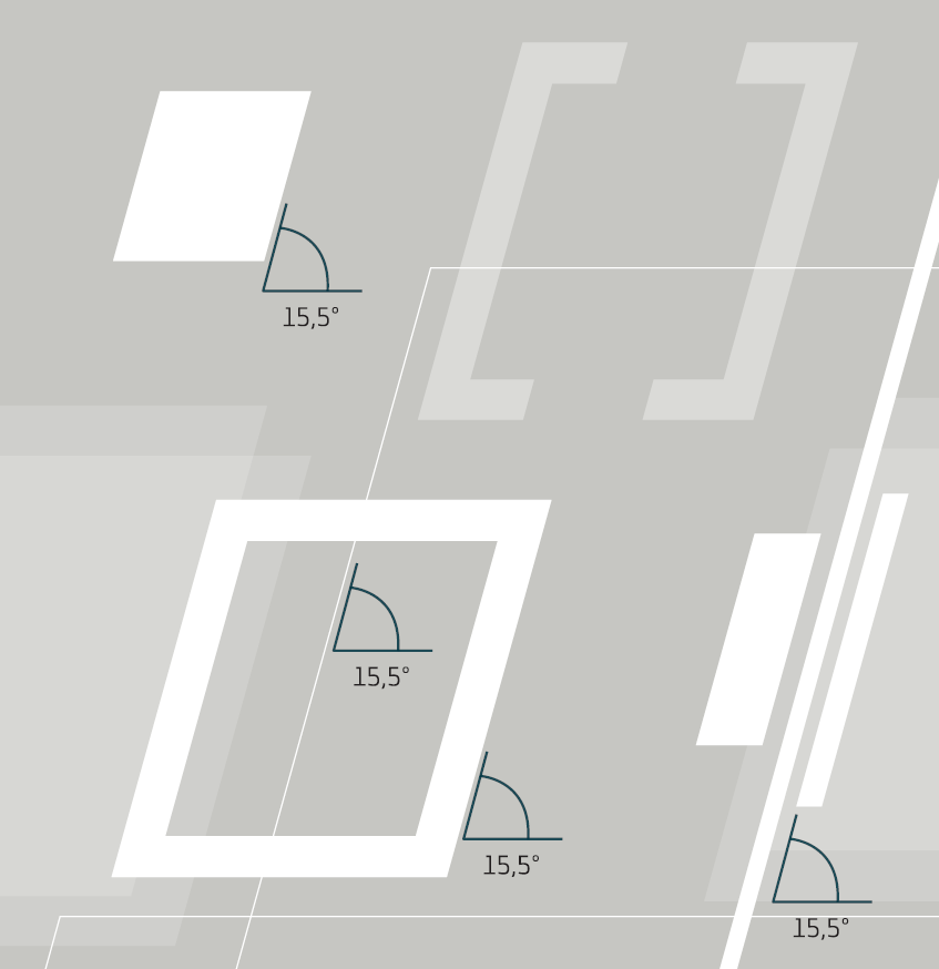
Surface Cut – The Slope in the Format
The 15.5° cut transfers the geometry of the rhomboid directly to the layout. A surface is cut diagonally along the edge of the format, creating a distinctive, recognizable silhouette.
The principle symbolically echoes the subtraction found in the figurative mark: it is not the rhomboid itself that is repeated, but rather its characteristic slant, which becomes an integral part of the design.
The cut creates a sense of movement, opens up the composition, and strengthens the visual connection to the INFORM logo.
The figurative mark is not reproduced.
Its geometry defines the format.
Application Requirements
- The angle of inclination is always 15.5°.
- The cut is used as an opening in a surface at the edge of the sheet.
- The area extends beyond the edge of the format and opens up there with the defined 15.5° bevel.
- Size and position depend on the format and composition.
- No additional rhomboid shape is constructed from the cut-out area.
- The crop should support the composition and must not detract from the content.

Rhomboid Spaces – Depth and Brand Presence
Two overlapping rhombuses can be used as a subtle background element. When rendered in transparent white, they create a sense of depth and anchor the figurative mark’s distinctive shape within the composition.
The position, shared size, and trim can be freely adjusted to suit the format and layout. The key factor is the interplay between the two overlapping shapes.
Overlapping creates depth. The positioning follows the composition.
Application Requirements
- always two overlapping rhomboids of equal size
- only white
- Transparency between 15 and 35%
- Size, position, and cutout can be freely selected
- The geometry and proportions of the rhomboid remain unchanged
- Use as a background element

The Braces – Structure in Space
The struts expand on the geometry of the rhomboid, transforming it into open, freely scalable design elements. They provide structure to the layout and create spatial tension.
Three to four related struts form a strut cluster. The angle of 15.5° and the parallel alignment remain constant. Depending on the format and composition, multiple clusters can interact with one another.
The geometry remains constant. The struts define the space.
Application Requirements
- Always maintain an angle of 15.5° and keep the alignment parallel
- Three to four struts form a strut assembly
- Width, length, thickness, and spacing can be selected as desired
- The position and framing follow the composition
- Multiple networks can interact with one another
- Preferably white and/or transparent
- alternatively, in the defined primary colors
- Consistent color scheme within a truss system
- Color selection that complements the background, application, and message
- Do not compromise content or readability

The Framework – Defining Relevant Areas
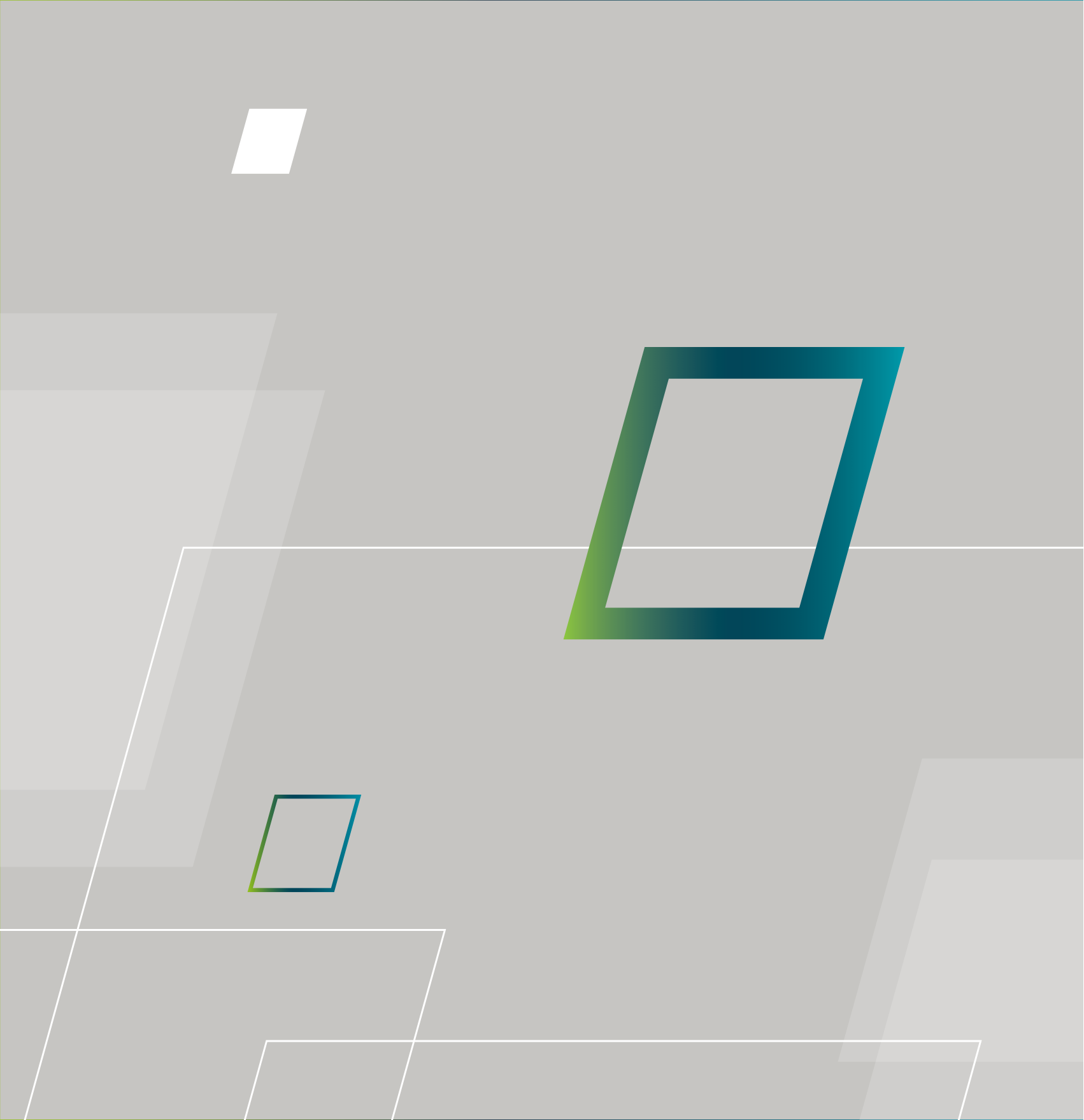
The frame highlights relevant areas within a composition. It lies over or behind images and text, and uses its alignment and cropping to direct the viewer's gaze.
It is available in two styles: solid or delicate.
The frame defines an area and draws the eye to it.
- Solid: INFORM gradient or white
- Filigran: exclusively INFORM color
Application Requirements
- 15.5° geometry required
- Can be used above or behind content
- Use framing and composition strategically to guide the viewer's gaze
- Do not alter the form or freely reproduce it
- Do not multiply for decorative purposes
> Download
Solid and delicate frames are available for download as SVG files in the specified versions.
The Focus – The Visual Indicator of Relevance
Focus creates a specific point of emphasis within a composition. Like a viewfinder, it directs attention to a particular element or detail without fully framing it.
Its two elements always form a single, indivisible unit.
The frame defines an area.
The focus sets a priority.
Application Requirements
- Always use both elements as a single unit
- Do not separate them or slide them against each other
- Scale proportionally as a whole unit
- Choose a position that matches the content
- Use only white or clear
- Use it deliberately and sparingly
> Download
The focus is available for download as an SVG file in the specified color variations.

Parallelograms – Dynamics and Space
Parallelograms are free design elements based on the
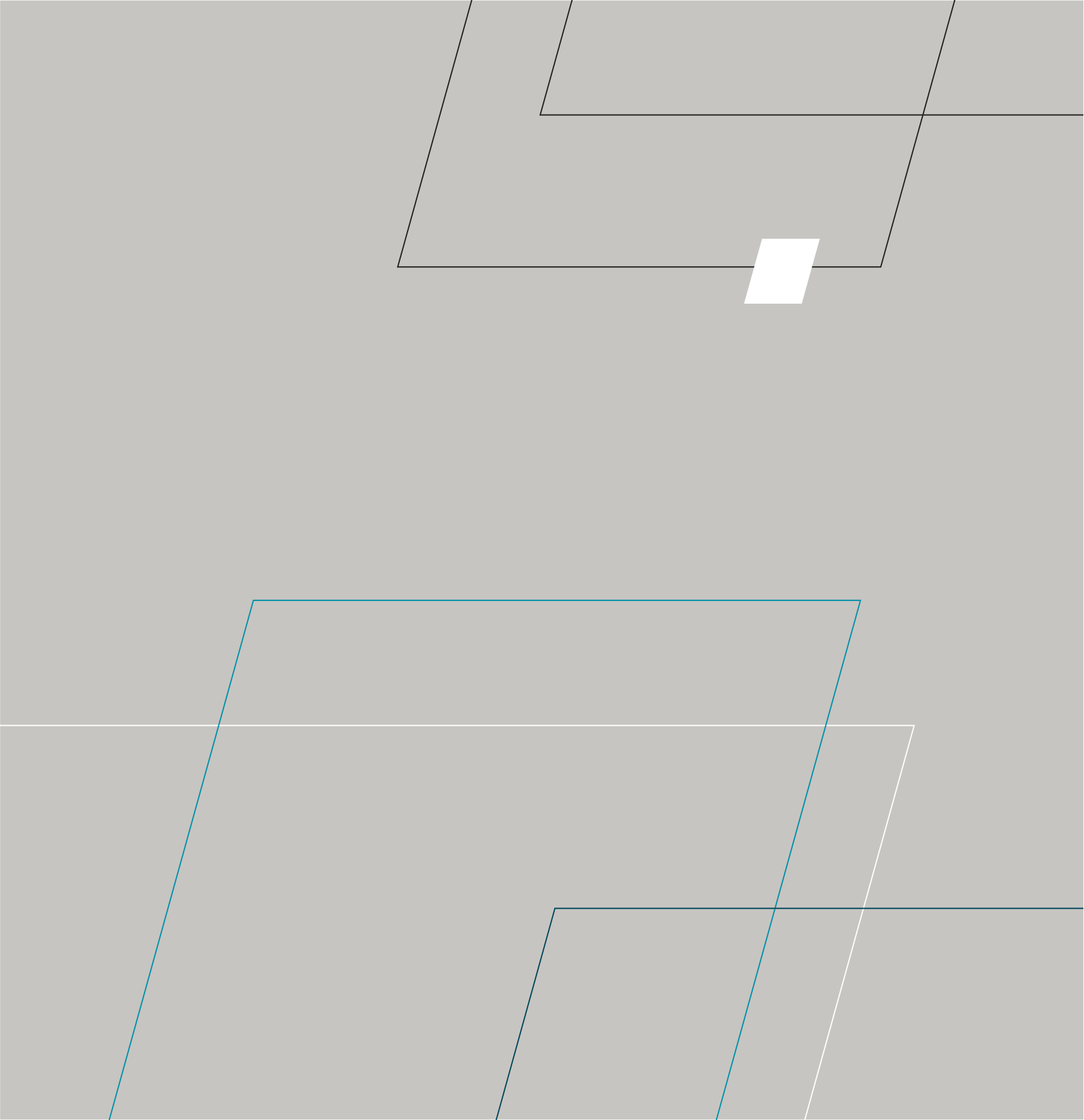
15.5° geometry. They create movement and spatial tension and can extend beyond image and text content as a graphic layer. They do not create spaces or areas for text placement.
Parallelograms structure the composition, not the content.
Application Requirements
- 15.5° geometry required
- clear distinction from the figurative mark
- Line weight: Choose a weight proportional to the format and size, and adjust it harmoniously within the composition
- Color: White, teal, or dark teal; black only for solid-color applications
- Cross-references and overlaps are permitted
- may continue to run visibly behind text and other content
- Do not use as a border or area for text placement
- Do not interfere with the content, logo, or information hierarchy
- Bleed required: at least one side must extend into the bleed area
- no closed shapes
Advanced Application
The 15.5° geometry of the Evolution elements forms the basis for further design principles and new visual applications. Existing elements can be combined, expanded upon in three dimensions, and adapted to meet new requirements.
In this way, new solutions emerge from the defined design language without losing the creative connection to the INFORM Design OS.
The geometry remains constant.
The application continues to evolve.

Downloads

: The Focus
: The Frame