The Color Palette of Our Visual Identity
INFORM’s color palette is a central component of our visual identity. At its heart is INFORM Teal—our brand color and the strongest color anchor of our visual identity.
Together with Teal Blue, Black, and White, Teal forms the mandatory core palette of the INFORM Design OS. Application colors, transparency gradients, and other defined extensions complement the system where additional differentiation, dynamism, or functional requirements call for it.
The use of color depends on the content, medium, and communication objective. As a result, the INFORM color palette combines a clear brand identity with the flexibility needed for a variety of applications.
Teal leaves its mark. The application determines the intensity.
INFORM Teal – Our Brand Color
Teal is INFORM’s signature brand color and the strongest color anchor of our visual identity. It defines our brand image across both physical and digital media and ensures high brand recognition.
A cool shade between green and blue, Teal combines precision and technological depth with a calm, modern look.
Teal defines INFORM's color identity.
Application Requirements
- Preferred color for brand-defining surfaces and design elements
- across media in physical and digital applications
- Together with Teal Blue, Black, and White, it forms the mandatory core palette
- Use defined color values consistently and accurately
PETROL
HEX #0090A7
RGB 000 | 144 | 167
CMYK 100 | 000 | 030 | 010
Pantone 7711
Character: Precise • calm • technical
Function: Defining brand identity
Usage: Backgrounds • Design elements
Core Colors – Our Color Foundation
INFORM Teal, Teal Blue, Black, and White make up the mandatory core palette of the INFORM Design OS. It serves as the foundation for a consistent and recognizable design across all media and communication channels.
Four core colors. A consistent visual identity.
PETROL
Character: Precise • calm • technical
Function: Defining the brand
Usage: Surfaces • Backgrounds • Design elements
HEX #0090A7
RGB 000 | 144 | 167
CMYK 100 | 000 | 030 | 010
Pantone 7711
BLACK
Character: neutral • high contrast
Function: functional color
Applications: typography • contrast • monochrome applications
HEX #000000
RGB 0 / 0 / 0
CMYK 0 / 0 / 0 / 100
BLAUPETROL
Character: deep • calm • confident
Function: Supporting core color
Usage: Large areas • Backgrounds • Distinction
HEX #004559 RGB 000 | 069 | 089
CMYK 100 | 000 | 015 | 070
Pantone 303
WHITE
Character: neutral • open
Function: functional color
Use: backgrounds • typography • contrast
HEX #FFFFFF
RGB 255 / 255 / 255
CMYK 0 / 0 / 0 / 0
Application Requirements
- Teal takes on the role of defining the brand
- Teal Blue complements the brand color and adds depth and differentiation
- Black and white serve as functional colors to provide contrast and clarity
- The use and weighting depend on the medium, content, and communication objective
- Use defined color values consistently and accurately
Application Colors – Functional Expansion
For applications requiring a higher degree of differentiation and visual structure, the core palette is supplemented by Night Petrol, Light Petrol, and Limonene Green. Application colors do not replace the core colors but rather expand them in a targeted manner to meet specific functional requirements.
Application colors support the content. The core colors define the brand.
NACHTPETROL
Character: Deep • Reserved
Function: Application Color
Use: Charts • Infographics • Differentiation
HEX #003543
RGB 000 | 053 | 067
CMYK 100 | 064 | 048 | 052
Pantone 5463
LICHTPETROL
Character: Light • Subtle
Function: Application Color
Use: Charts • Infographics • Differentiation
HEX #22BDD6
RGB 034 | 189 | 214
CMYK 068 | 000 | 016 | 000
Pantone 310
LIME GREEN
Character: Dynamic • Expressive
Function: Application color
Use: Charts • Infographics • Differentiation
HEX #95C11F
RGB 149 | 193 | 031
CMYK 050 | 000 | 100 | 000
Pantone 382
Application Requirements
- Night Petrol and Light Petrol for additional color gradations and differentiation
- Lime green for subtle accents and highlights
- Especially for charts, infographics, and tables
- Use based on content, function, and required differentiation
- Do not use as font colors
- No use of lime green as a standalone decorative color or over large areas
Transparency gradients – Color unfolds
Skip to content
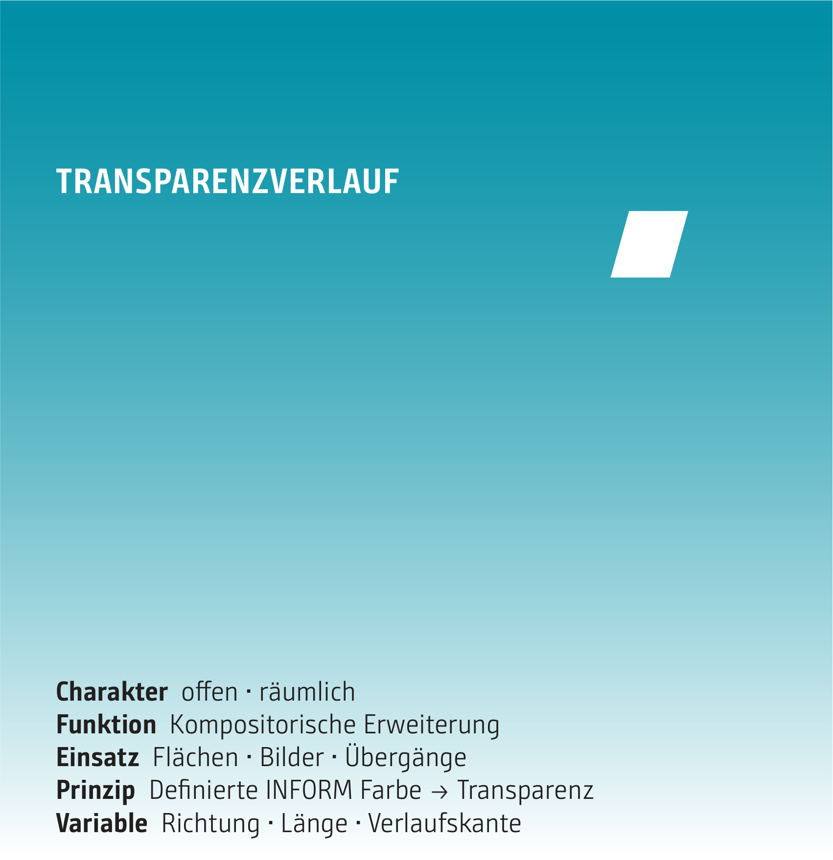
Transparency gradients blend defined INFORM primary colors into transparency. They connect areas of color with images or backgrounds and create seamless transitions within the composition.
The color remains distinct. Transparency expands its range of applications.
Application Requirements
- Exclusively defined INFORM core colors
- Always transition from color to transparency
- Freely adjust the direction, length, and edge alignment to suit the format and content
- No free transitions between different core colors
- Use primary colors as solid color areas without altering them
Dynamic Color Gradient – Creating Visual Worlds
The dynamic color gradient combines lime green, dark teal, and teal, adding a dynamic, expressive dimension to the INFORM color palette. It is used in particular to bring visual worlds to life.
The composition enhances the visual impact. The subject remains in focus.
Application Requirements
- The color sequence Lime Green → Dark Teal → Teal must be strictly maintained
- The path is behind the image
- Reduce the opacity of the image so that the gradient becomes visible
- Adjust the position, size, and orientation to suit the format, subject, and composition
- Do not compromise image quality or readability
- Do not replace lime green with other colors within the gradient

Character: Dynamic • Expressive
Function: Creation of visual worlds
Application: Visual worlds • Eye-catching communication
Color sequence: Lime green → Dark teal → Teal
Variable: Position • Size • Orientation
Passepartout – Space for Content
Passepartout serves a clearly defined purpose as a background color for charts and illustrations. Its light, warm-neutral shade creates a subtle contrast, visually delineates content, and highlights it without drawing attention to itself.
A mat creates space and subtly highlights the content.
Application Requirements
- as a background for charts and illustrations
- creates a solid foundation for adaptive color palettes
- use them specifically to visually distinguish between different types of content
- Do not use as a general background or design color
- The specified color value is used as is
PASSEPARTOUT
HEX #c6c6c2
RGB 198 | 198 | 194
CMYK 025 | 019 | 022 | 002
Pantone 7535
Character: Warm-neutral • Calm
Function: Presentation area
Use: Background for charts • Illustrations