Characteristics, Use, and Application
The INFORM logo consists of the figurative mark (rhombus) and the word mark (logotype). Both elements form a single, indivisible unit. Their arrangement and proportions are mandatory and must not be altered.
The complete logo serves as the brand’s identifier. The rhomboid is used as a standalone figurative mark and is a mandatory visual brand element. It enhances brand recognition and defines INFORM’s visual language.
The sender function is always reserved for the full INFORM logo.
The logo serves as a symbol.
The rhomboid defines the visual identity.
The logo—the consistent signature of our brand
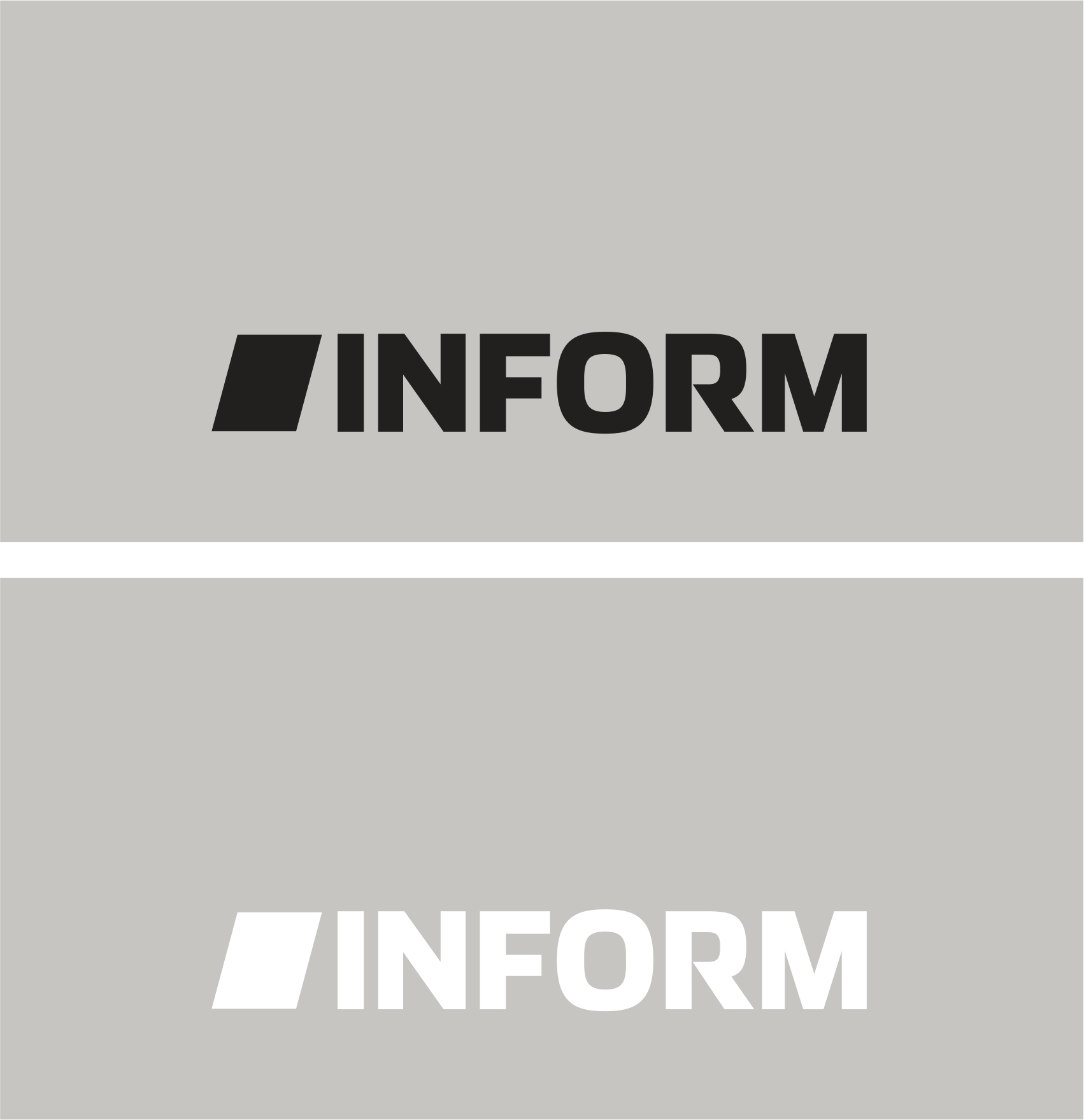
The INFORM logo is available in black and white (negative). The black version is the preferred standard version. The white version is used when the background or contrast does not ensure the legibility of the black version.
Extended rules apply when using the product in the BrandFrame. For more information, see the section “Use on the Surface.”
The logo remains consistent. Its use depends on the context.
> Download
The INFORM logo is available for download as an SVG file in the defined black and white versions.
Protected Area and Minimum Size
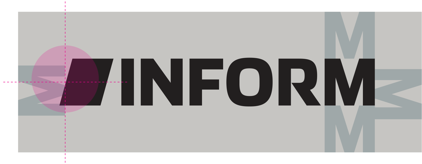
The INFORM logo has a defined clearance zone. This zone is at least as tall as the uppercase letters I, N, F, or M and must be maintained around all text, images, and design elements.
With regard to the angle of the figurative mark, the protected area is defined by the central axis of the rhomboid.
Minimum size:
Print: 10 mm
Digital: 38 px
The clearance zone and minimum size are mandatory and ensure clear, consistent brand labeling.
Logo in BrandFrame –
Flexible, clear, and context-sensitive
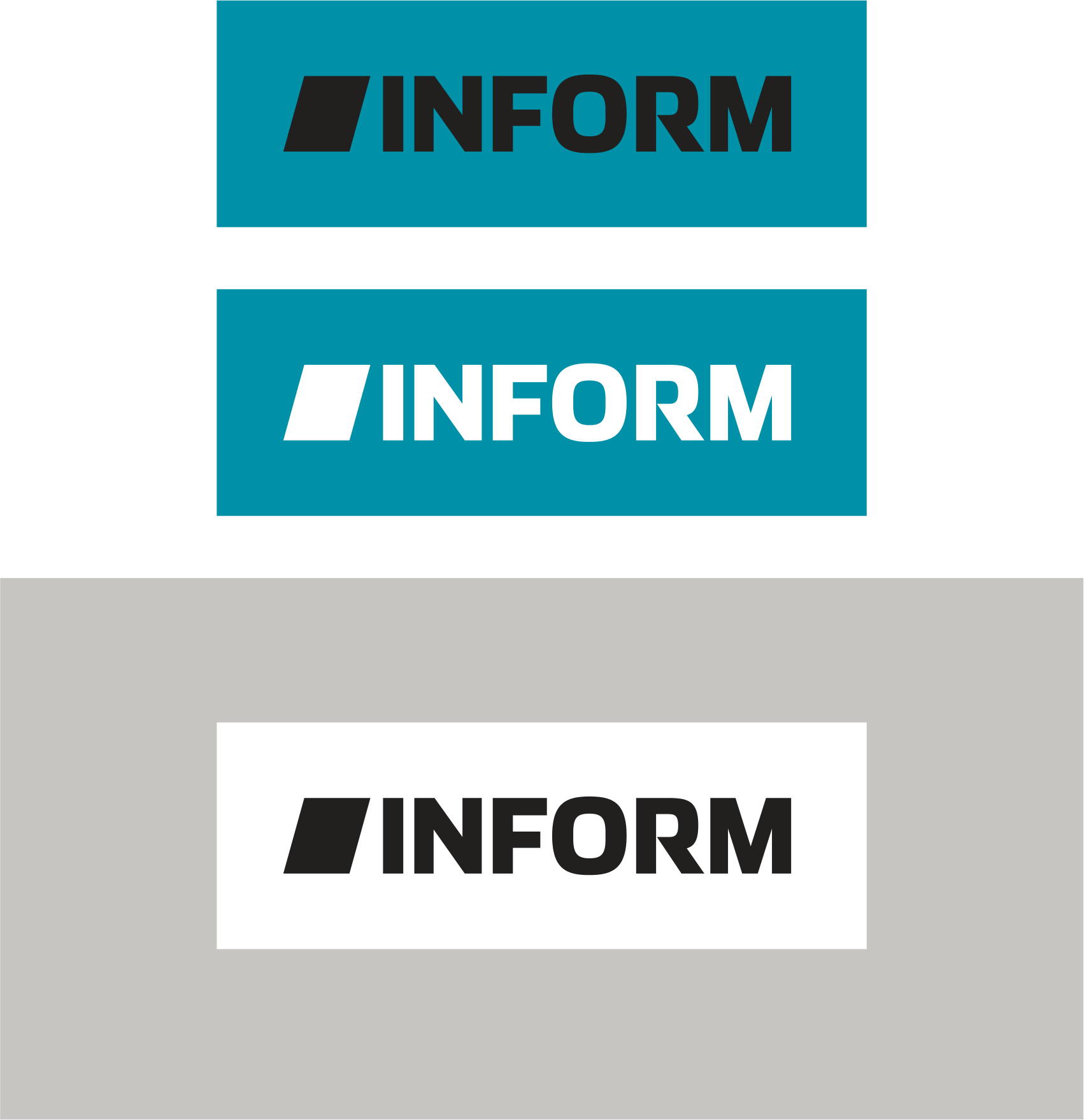
BrandFrame ensures clear and consistent brand identification and allows for flexible use of the logo on various backgrounds.
Within the BrandFrame, the black and white versions of the logo are used interchangeably. The choice depends on readability, contrast, and how the logo appears against the background.
Black and white are equally valid options. It depends on the context.
> Download
The INFORM logo in the brand frame is available for download as an SVG file in the defined versions.
Placement and Minimum Size
The BrandFrame is always placed on one side of the layout. The logo’s protection zone applies to all open sides. The minimum distance is equal to the height of the uppercase letters I, N, F, or M.
Minimum size for BrandFrame:
Print: 14 mm
Digital: 50 px
Anchored on one side. Protected on all open sides.
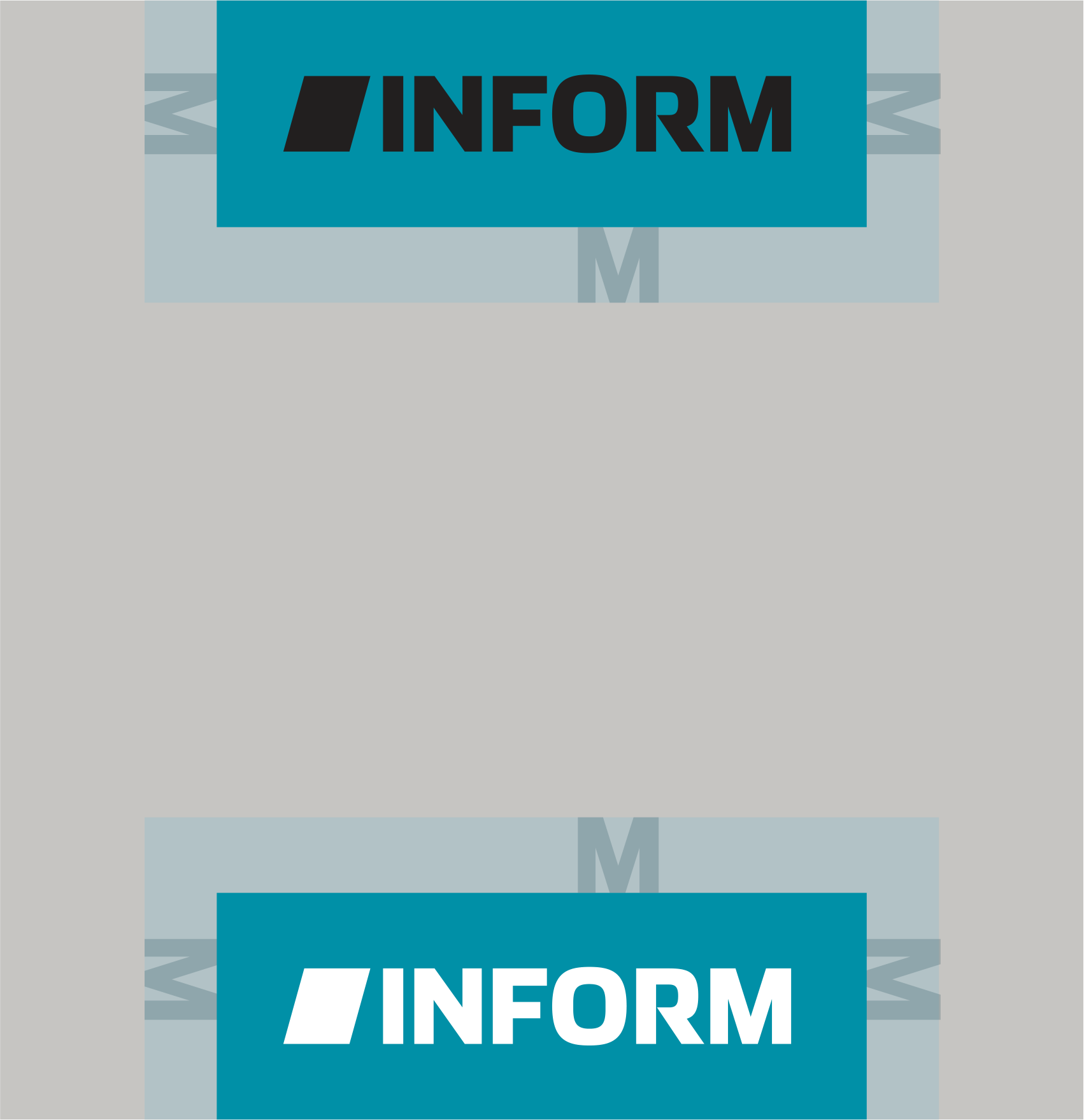
Use on light-colored surfaces
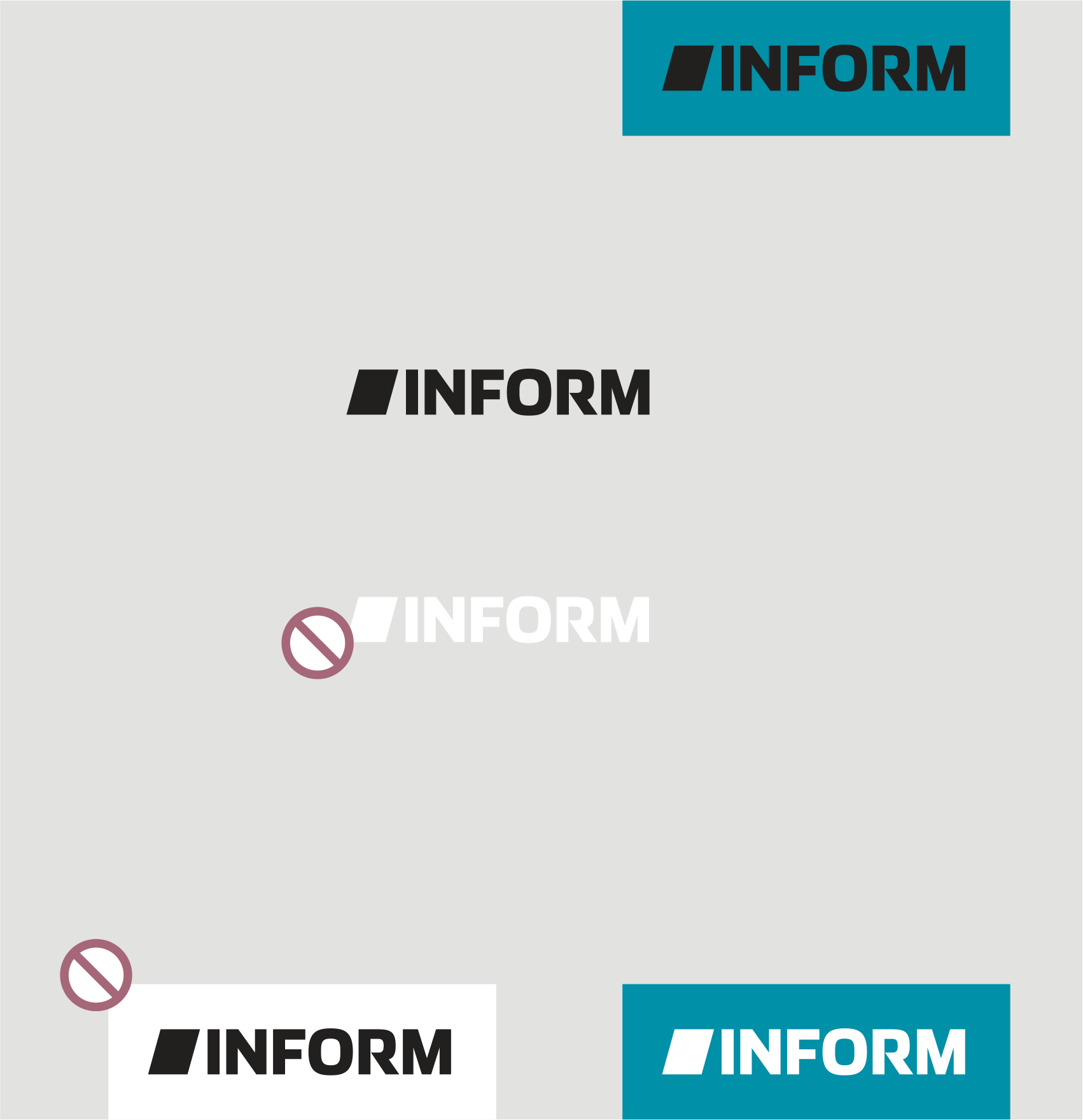
The black version of the logo is used on light-colored surfaces. It can be positioned freely, provided the defined clearance zone is observed. The minimum distance must be maintained from the edges of the layout as well as from external or non-system elements.
The BrandFrame is mounted at the top or bottom and can be freely positioned along this axis. A minimum distance from the lateral edges of the format must be maintained, corresponding to the height of the uppercase letters I, N, F, or M.
The white logo variant is not used on light-colored surfaces, as the required contrast cannot be guaranteed.
Light background = black logo.
The BrandFrame provides additional flexibility.
Use on dark surfaces
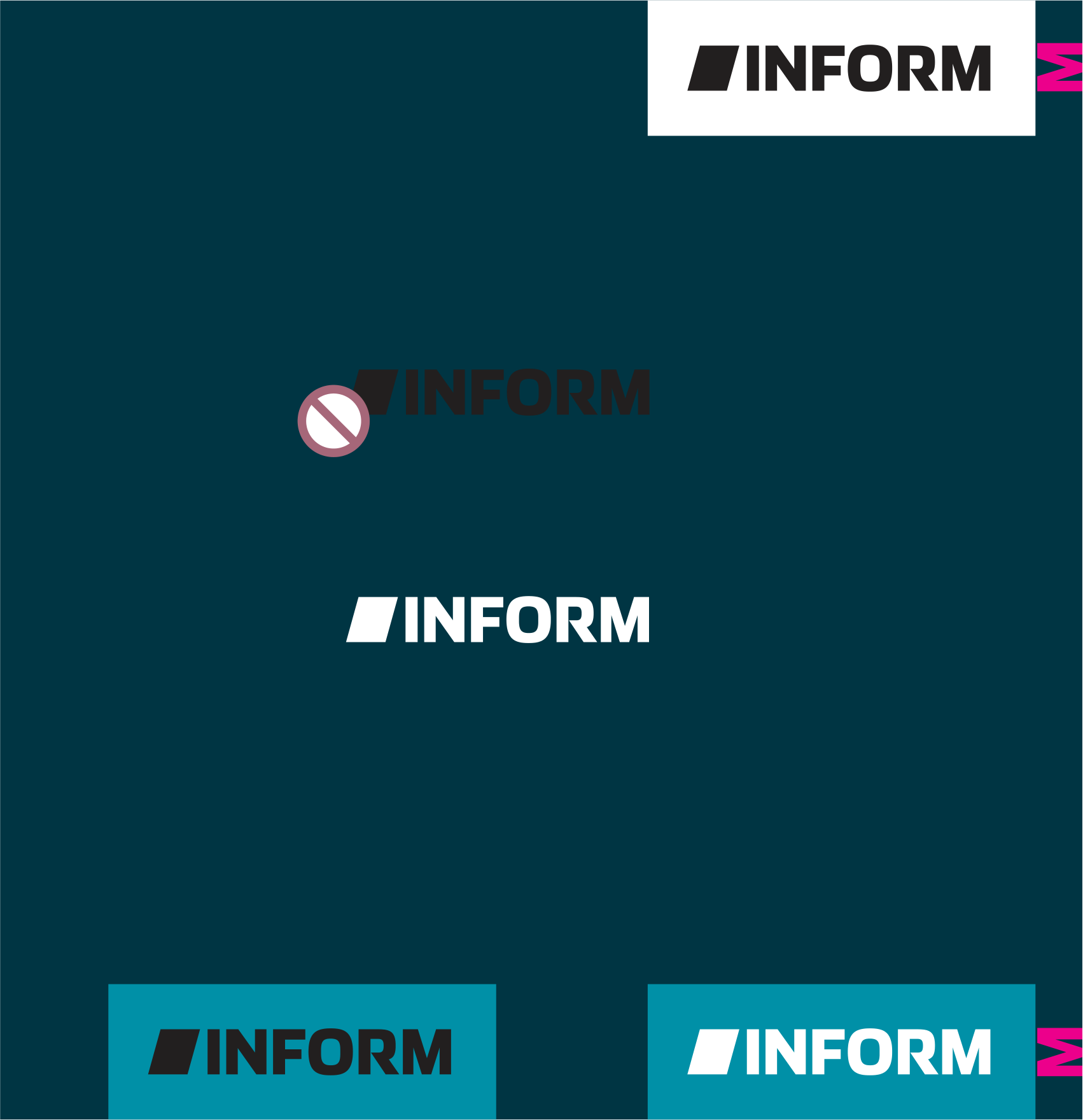
To ensure optimal readability, there must always be sufficient contrast between the logo and the background.
The white logo is positioned freely on dark surfaces—while adhering to the defined clearance zone and maintaining the minimum distances from the edges of the layout and other elements.
The logo within the BrandFrame is placed at the top or bottom and can be freely positioned along this axis. A minimum margin must be maintained from the side edges of the format, equal to the height of the uppercase letters I, N, F, or M.
The black version of the logo is not used on dark surfaces because the required contrast cannot be guaranteed.
Dark area = white logo.
Use on variable backgrounds
On variable backgrounds, such as image areas or color gradients, the logo variant is chosen based on the best possible contrast. Readability is always the top priority.
The logo may be positioned freely, provided that the defined protection zone and minimum distances are observed.
The BrandFrame creates a clearly defined logo area within a busy visual layout. It is mounted at the top or bottom and can be freely positioned along this axis. The minimum distance from the side edges of the layout is equal to the height of the uppercase letters I, N, F, or M.
The motif determines the logo variant. The BrandFrame ensures visibility.

DON’Ts – Changes to the Logo
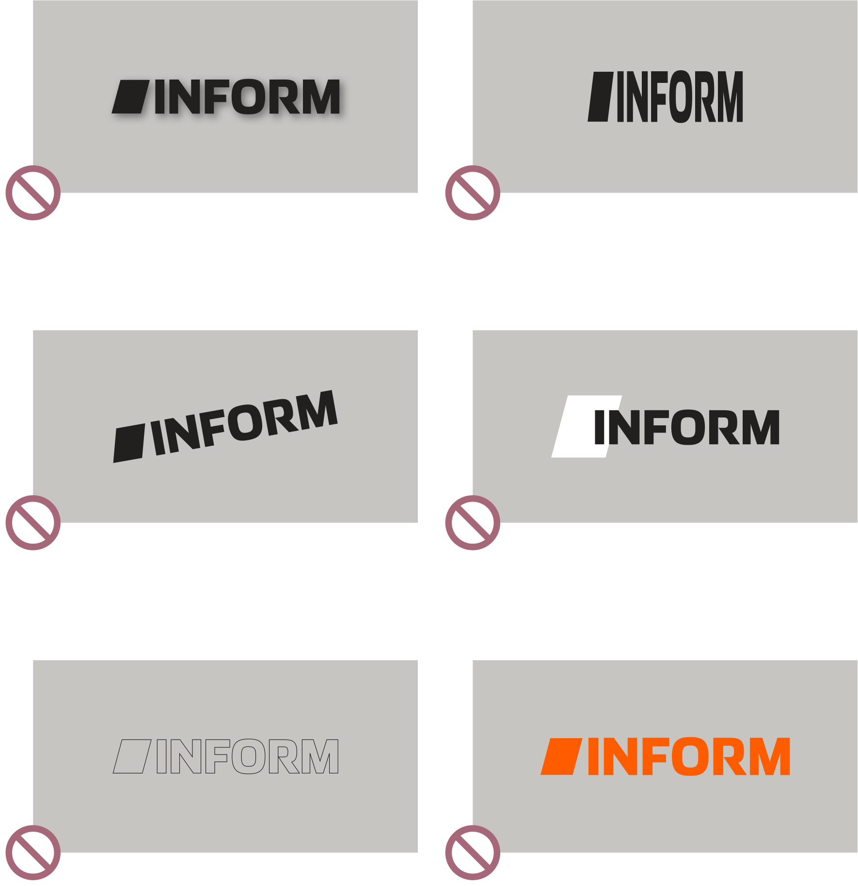
The INFORM logo is strictly defined in terms of its shape, proportions, color, and design. Changes or customizations are not permitted.
No effects
: Shadows, glows, gradients, outlines, 3D effects, transparency, or other graphic effects are not permitted.
No changes
The logo must not be distorted, rotated, cropped, compressed, or redrawn. Proportions, spacing, and alignment must remain unchanged.
No changes may be made to the logo elements—
—and the figurative and word marks may not be separated, replaced, moved, or recombined within the logo.
No free choice of colors
The logo is used exclusively in the defined black and white versions, as well as within the BrandFrame.
The logo is a constant. It is applied, not designed.
DON’Ts – Use of the Logo
The placement of the INFORM logo also follows clear rules. The background, surrounding elements, and other sender information must not interfere with its legibility or distinctiveness.
> See "Using Variable Backgrounds."
No unsuitable backgrounds
The logo must not be placed on patterns, low-contrast or highly busy surfaces, or on transitions that impair its legibility.
No integration with other design elements
The logo must not be framed, overlaid, combined with image content, or embedded in other shapes or graphics.
No Unregulated Logo Combinations
The combination of the INFORM logo with third-party logos must follow mandatory rules regarding hierarchy, size, spacing, and positioning. Free-form arrangements and custom combinations are not permitted.
The logo remains distinct. Legibility and a clear identification of the source always take priority.
Downloads

Logo with a defined protection zone
Logo with BrandFrame