The text in which INFORM speaks
Typography not only determines what we communicate, but also how INFORM is perceived. It shapes the character of our visual identity and ensures clarity, recognizability, and consistent communication across both physical and digital media.
With Bunday Sans™, INFORM has a corporate typeface that combines technical precision with a clean, open, and modern look. Its various typefaces allow for a flexible typographic hierarchy—from striking headlines to calm body text.
Bunday Sans is complemented by Aptos Narrow as the designated system font. It is used in situations where technical availability and reliable communication across different work environments are required.
Common typographic rules tie the two typefaces together into a consistent system and ensure typographic quality across different applications.
Bunday Sans sets the tone. Aptos Narrow ensures the application works smoothly.
Two fonts. Two functions.
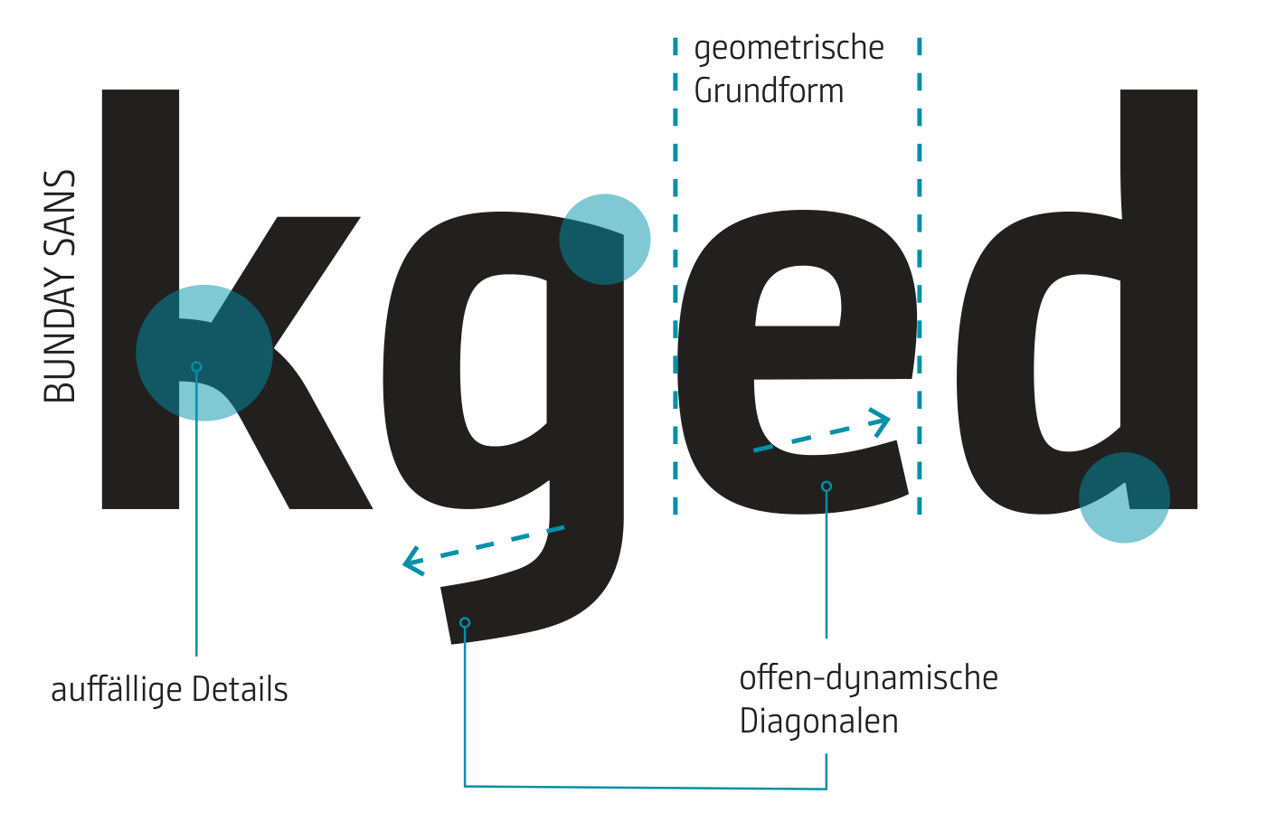
Bunday Sans™ is INFORM’s corporate typeface and defines our typographic identity. It is used wherever the font is technically available.
Two fonts. Two functions.
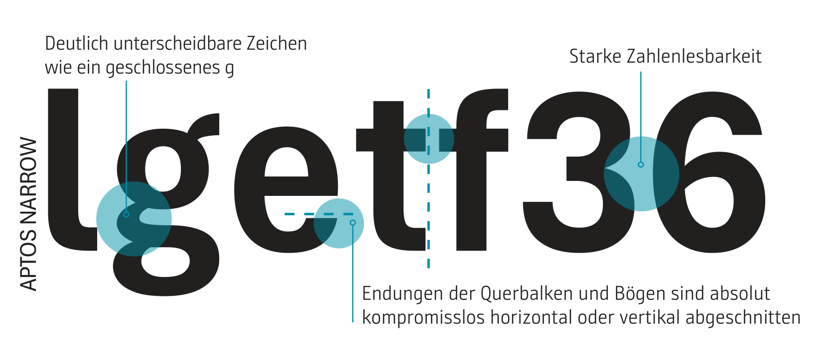
Aptos Narrow is the designated system font for applications where compatibility and interchangeability are paramount. It ensures reliable rendering when documents are shared or co-edited outside the controlled INFORM environment.
Both typefaces thus serve different purposes within a shared typographic system.
Bunday Sans for brand identity. Aptos Narrow for compatibility.
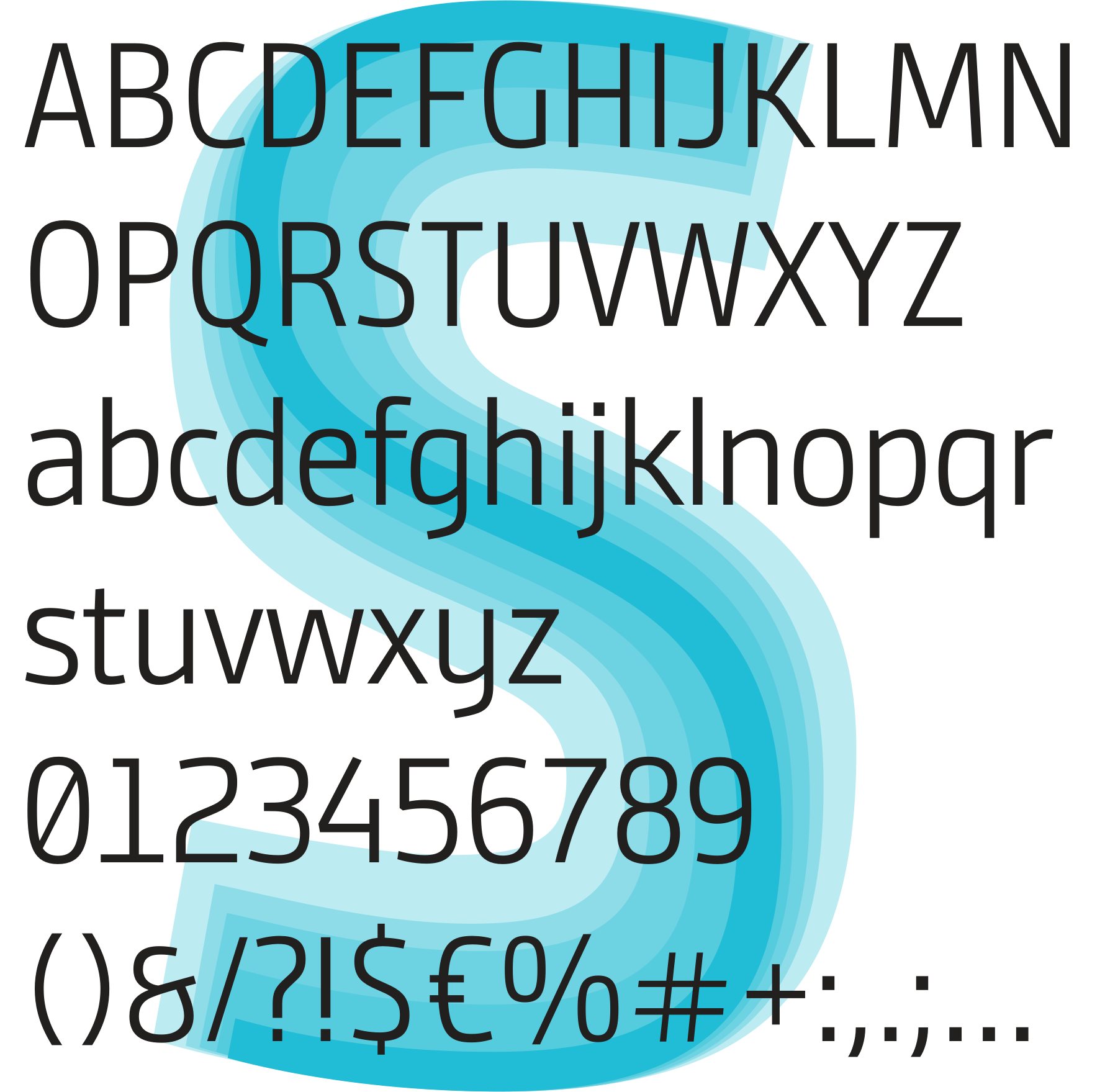
Bunday Sans™ – Our Corporate Typeface
Bunday Sans™ is INFORM’s corporate typeface. Its clean, open design combines technical precision with excellent readability and defines the typographic character of our visual identity.
The typeface family offers a variety of styles for clearly defined typographic functions—from calm body text to eye-catching headlines.
Bunday Sans gives INFORM a distinctive typographic voice.
Typefaces – Hierarchy Through Weight
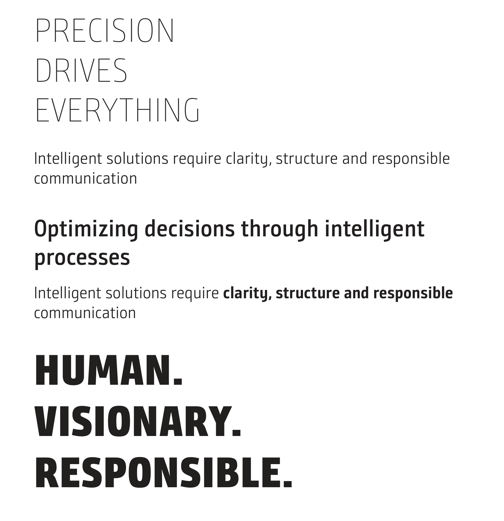
The weights of Bunday Sans serve different functions within the typographic hierarchy. Their use depends on content, size, and typographic emphasis.
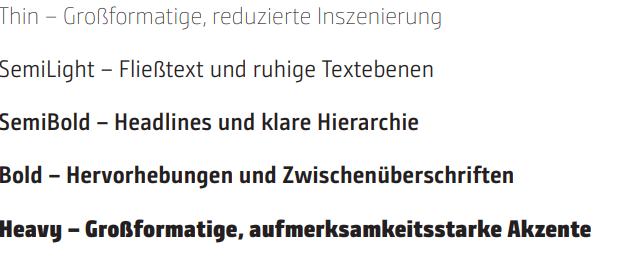
SemiLight and SemiBold form the typographic foundation.
Bold adds emphasis. Thin and Heavy set the scene.
Typographic Hierarchy
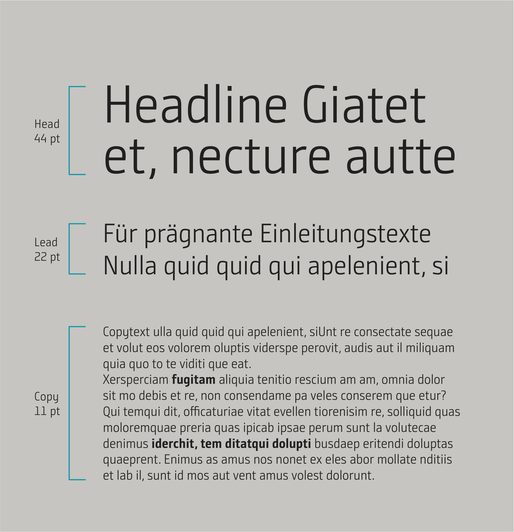
The typographic levels create a clear hierarchy of information.
As a general guideline, the font size of the text that follows is approximately
50% of the font size of the preceding text.
Headline – most impactful level of information
Lead / Subline – introduces the content
Copy – conveys longer content
Caption – provides additional information
The hierarchy remains constant. The size depends on the application.
Sentence Structure and Reading Fluency
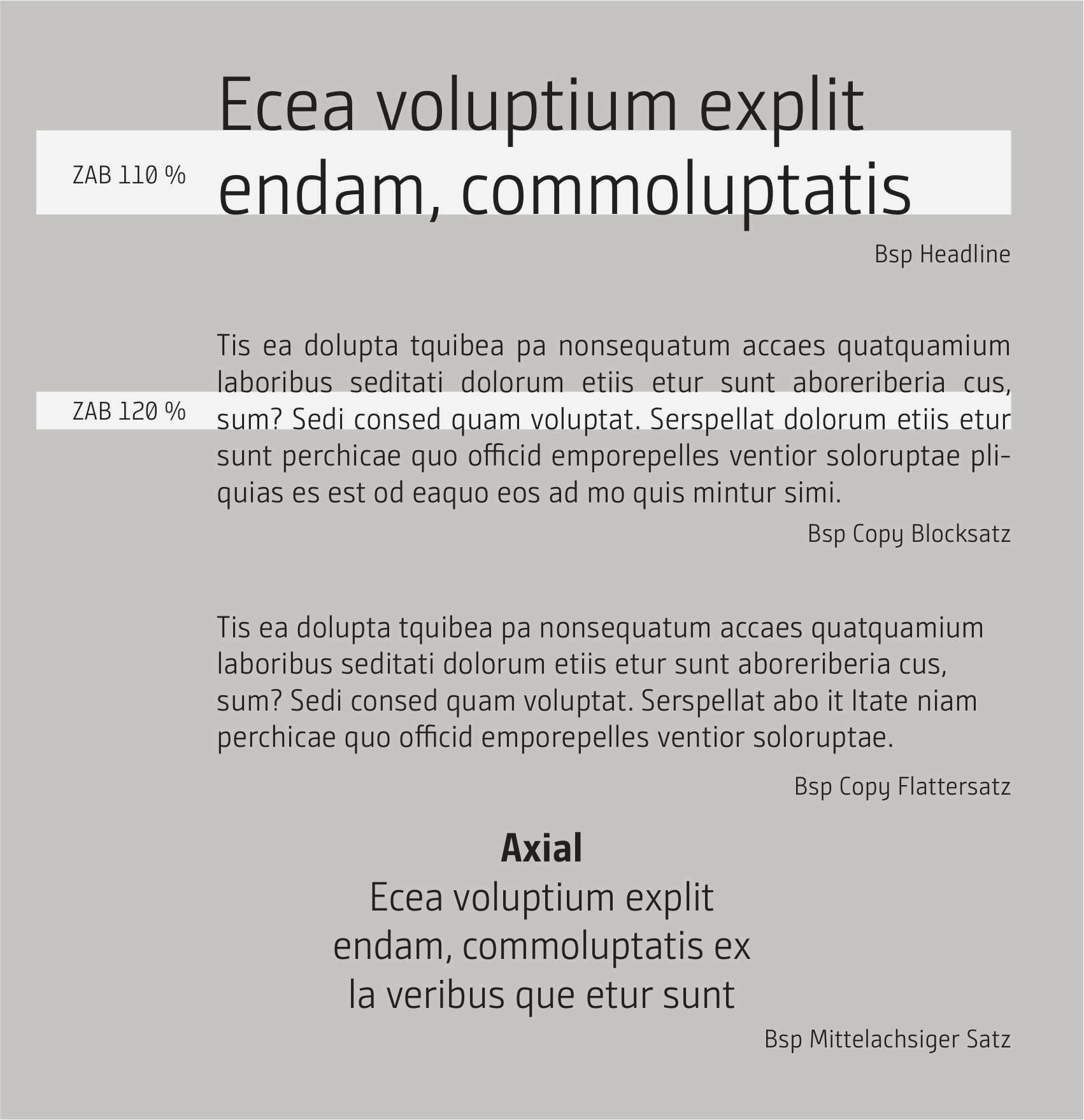
Left-justified justified text is the default alignment in INFORM Design OS. It ensures a clear reading flow and is suitable for most text and information formats.
Justified text can be used for longer blocks of text, provided that word spacing and hyphenation allow for a balanced layout.
Justified text is used specifically as a design element—for example, on covers and title pages for short lists, contents, or facts. It is not intended for longer blocks of text.
The center-aligned layout is suitablefor short headlines, statements, and stylized text modules. It is not used for large blocks of text or functional UI/UX applications.
Line spacing
; headlines and lead copy: approx. 110%
; body copy and captions: approx. 120%
Text alignment is determined by content, format, and function.
Additional Basic Typographic Rules
Emphasis
In body text, emphasis is indicated by using bold type. Bold type can also be used to structure the text with subheadings.
Text Color and Contrast
Text is generally displayed in black on light backgrounds and in white on dark backgrounds or images. Readability and sufficient contrast are always a priority.
Captions
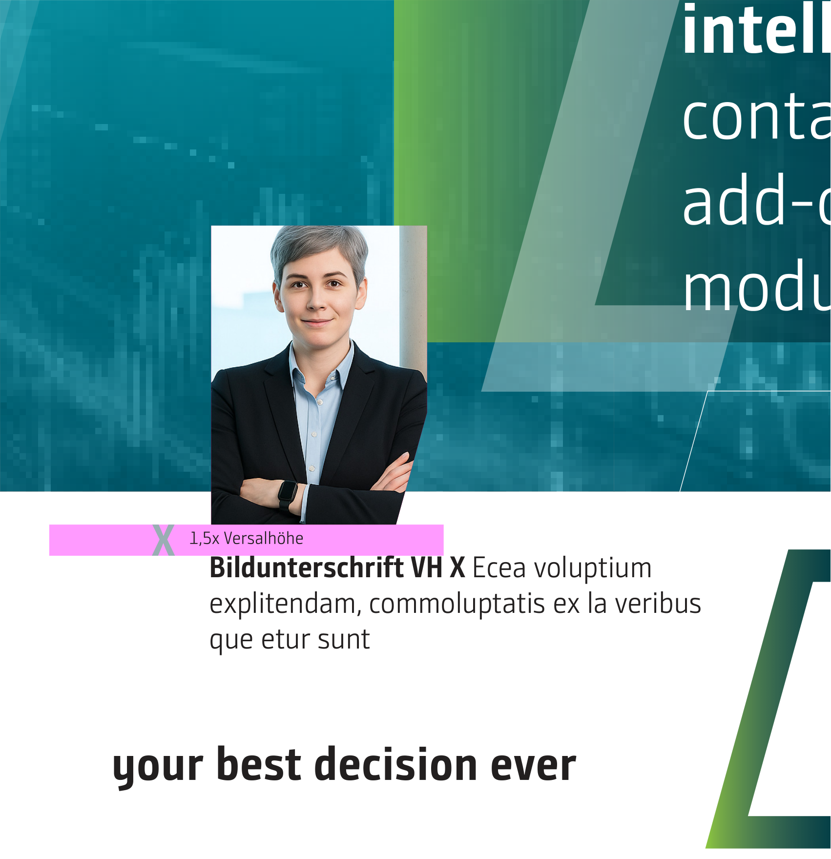
Captions provide additional information for images, graphics, and tables. They are set in SemiLight. Specific details can be highlighted in bold.
Image and caption
. The spacing between the image and the accompanying text is 1.5 times the ascender height of the font used.
Typographic Details – Precision in Typesetting
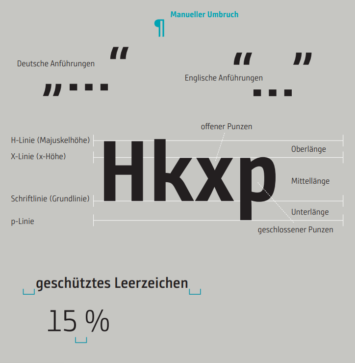
Typographic details ensure a precise and consistent typeface. They define the use of spacing, punctuation and special characters, units, and formal conventions, thereby establishing binding standards for everyday use.
They also address those details that often seem obvious when reading but are crucial for a consistent appearance. Clear writing styles and consistent typographic conventions make it easier to navigate the text and ensure that information is presented clearly and consistently.
The rules apply across all media and promote readability, clarity, and typographic quality—from individual characters to complete texts.
Precision is evident in the details.
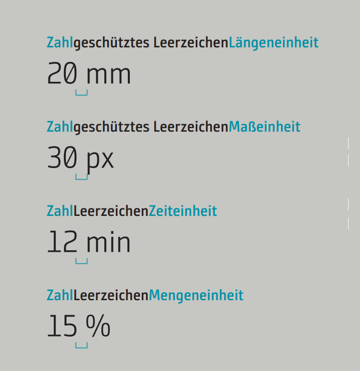
Distances & Units – Setting Connections Correctly in
To display numerical values and units, INFORM uses a clear,
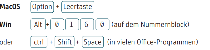
functional spacing system. According to DIN 5008, numbers and units are separated by a non-breaking space to create a unique,
consistent, and indivisible connection.
The input format varies depending on the system.
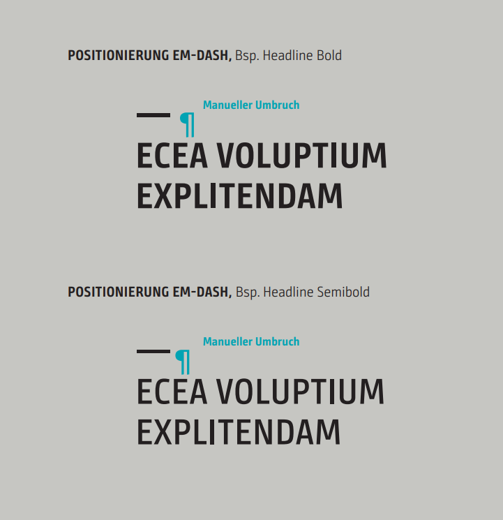
The EM Dash—A Visual Anchor for
Headlines
Unicode characters are useful when working with typographic characters.
When using the em dash (a dash the width of the letter M) to position text above the headline, it should always maintain the same proportion to the font size.
Here are two examples of how it can be used.
EM Dash Unicode: 2014
Keyboard Input:

Additional Typographic Characters
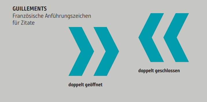
Quotation marks (guillemets)
Be sure not to use the "" characters here.
Unicode: 00AB (double opening) and 00BB (double closing)
Keyboard Input

...
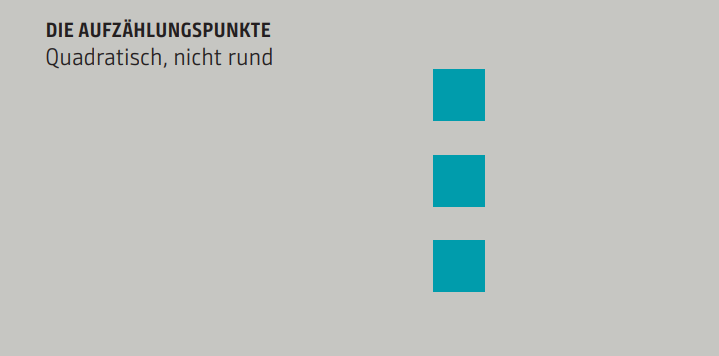
Bullet points
All bullet points should be set using the squares in the typeface.
Unicode: 2022
Keyboard Input

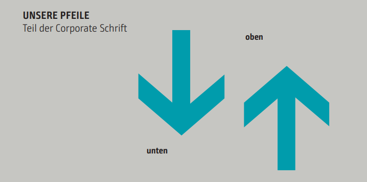
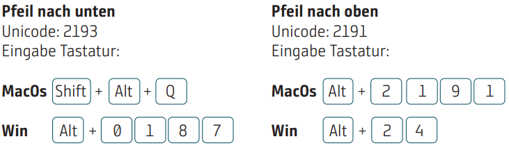
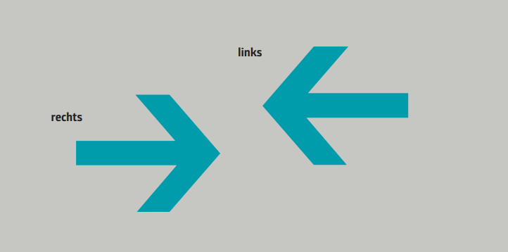
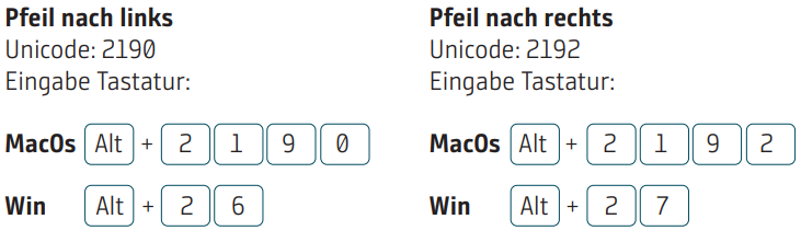
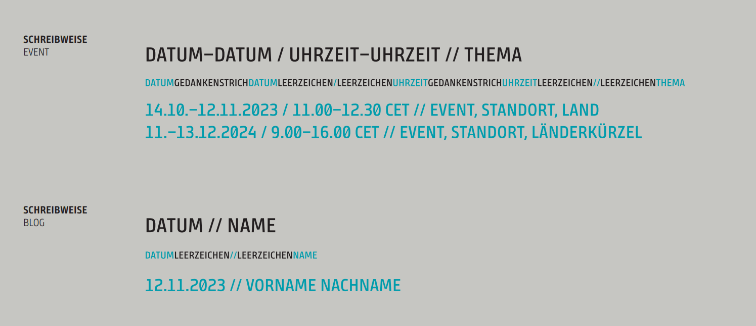
Formal Writing Conventions – Dates and Times
Formal Writing Styles – Addresses and Contact Information