
Evolutionary Elements – Formative, Adaptive System Elements
The evolutionary elements expand on CORE components with striking, adaptive features. They add extra depth, dynamism, and memorability to the look and feel of INFORM. Many of these elements are derived directly from our brand mark – the rhomboid – and transfer its characteristic form logic to new, flexible applications.
While the CORE forms a stable foundation, its evolutionary elements establish dynamic visual progression that makes INFORM appear more energetic, more vibrant, and more iconic.
The brand mark evolves into a frame, a connector, a focus
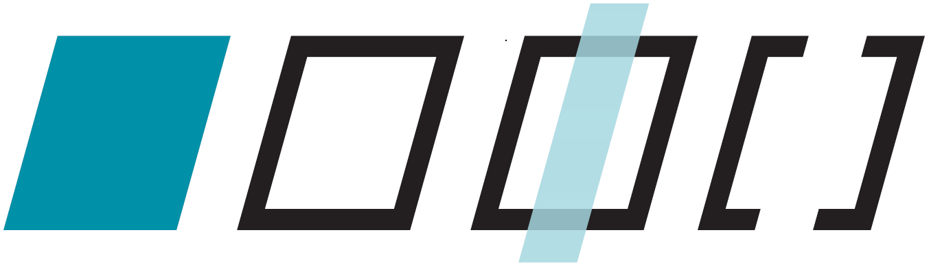
The role of evolutionary elements within the overall system
Together, angle, frame, and spotlight form a visual evolution layer that:
- strengthens the brand’s character,
- adds energy and motion to the design,
- opens up new creative possibilities,
- and lends INFORM a modern, distinctive appearance.
They do not replace CORE elements, but rather deliberately expand upon them in a dynamic, adaptive, and precisely defined manner.
.
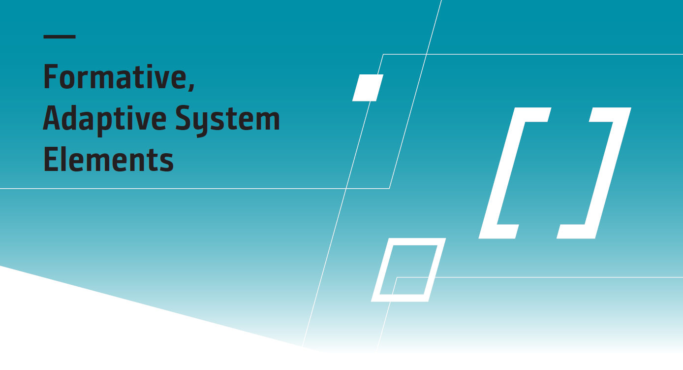
The Angle – Our Defined Dynamic (15,5° Shear)

A key evolutionary element is the striking angle, based on a precise shear angle of 15.5°. This fixed angle is not a decorative detail, but a recurring design motif that:
- provides orientation,
- creates momentum,
- reinforces INFORM’s visual identity,
- and acts as a unifying design signal.

The angle thus forms the foundation for additional adaptive shapes, which ared used as formative stylistic elements in the Design OS an consistently continue the brand’s visual dynamics.
The Frame – A Striking Extension of the Rhomboid
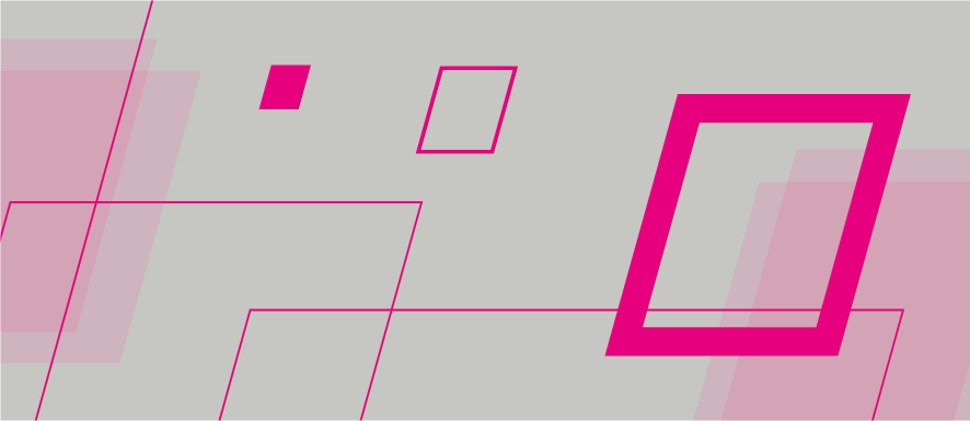
- as an element for highlighting content,
- as a structuring design tool,
- as a recognizable brand anchor,
- as a stage for typography, graphics, or imagery.

The frame is available in two variants:
- White – for maximum clarity and precision,
- Filled with the INFORM color gradient – for expressive, contemporary visual worlds
As an adaptive element, the frame is directly derived from the formal logic of our rhomboid. Thus. it remains deeply anchored in INFORM’s brand identity. It extends the system with a dynamic, distinctive design tool that that has both a structural and atmospheric effect without ever overshadowing the CORE elements.
The Spotlight – Our Iconic Bracket
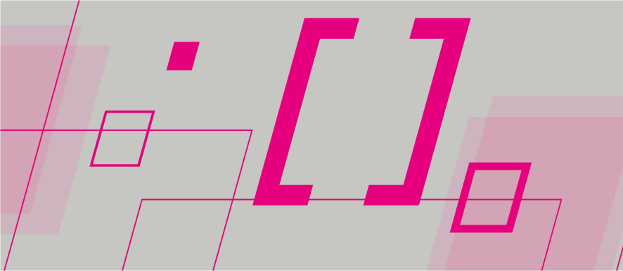
The focus is not a decorative element, but a functional signal that:
- strengthens visual hierarchy,
- precisely adds emphasis,
- draws attention to specific content,
- creates a clear visual focal point.

The focal bracket is currently available in white, teal, blue teal, and optionally black.
This allows the bracket to be used flexibly while clearly anchored within INFORM’s color space.
As part of the evolutionary design layer, its color palette may be selectively expanded in the future, whenever newly defined colors meaningfully support the function, clarity, and signal effect of the focus element in a manner consistent with the Design OS.
Parallelograms – Free tectonic Elements based on the Angle
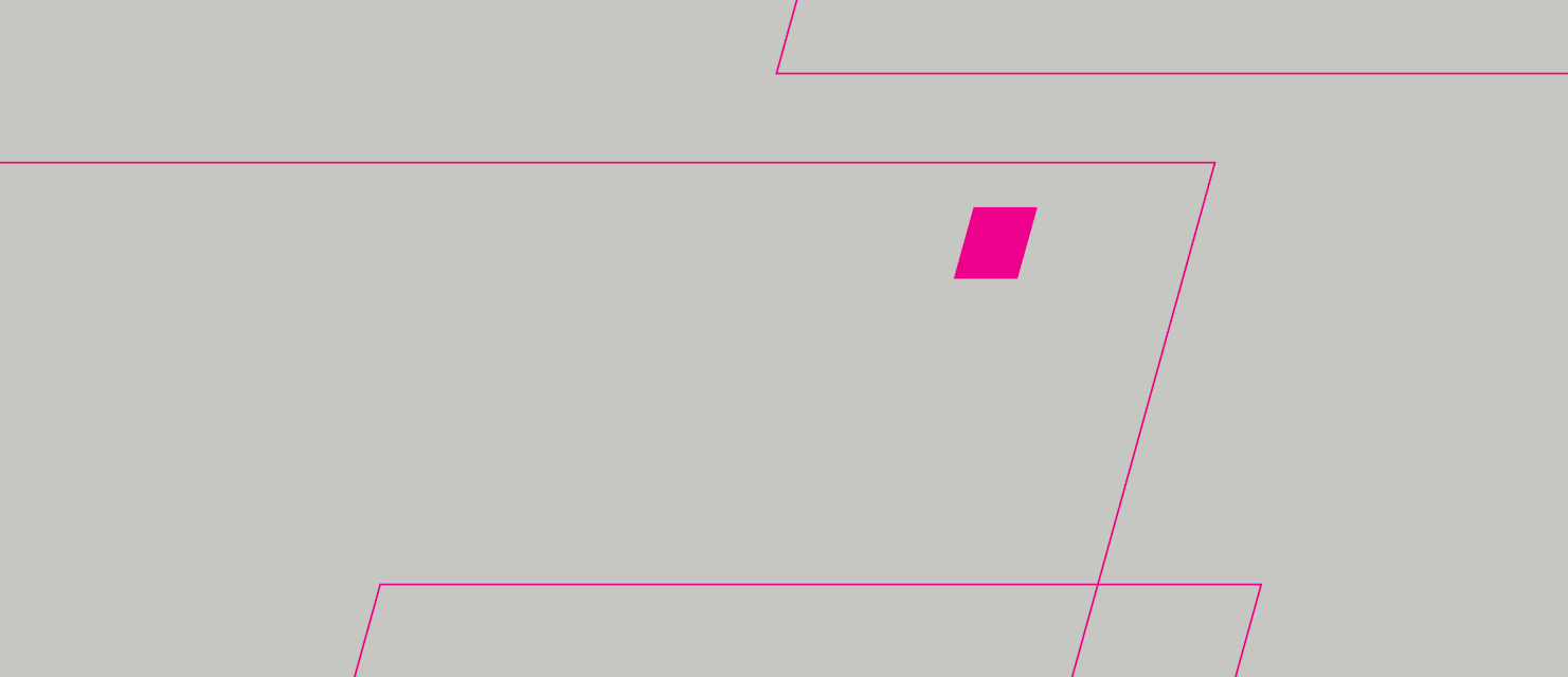
Independent of the brand mark’s fixed aspect ratios, parallelograms based on the defined 15.5° angle may be used as autonomous, tectonically shaping elements.
They function as light, dynamic outlines that add structure, movement, and spatial tension to the layout, without overshadowing the CORE elements.

These parallelograms are deliberately rendered with thin strokes and may be used in the following color variants:
- White
- Black
- Teal (extended color palette)
Design Rules for Parallelograms
Proportions and distance from the brand mark
The shapes must not closely match the exact proportions of the rhomboid in order to maintain a clear visual distinction from the brand mark.
Stroke weight within the system context
Line thickness must align and harmonize with the other elements of the layout (typography, image areas, frames). Parallelograms are design accents, not dominant surfaces.
Intersections are permitted
Parallelograms may overlap or intersect as long as the overall effect remains calm, structured, and controlled.
Dynamic reading direction
The lines should introduce movement and subtly suggest a reading direction or spatial tension, without overlapping content or distracting from the logo and CORE elements.
Strong bleed is mandatory
The resulting outline spaces must actively bleed and extend to the trim on at least one side.
This ensures that parallelograms remain open, dynamic design spaces – readable without becoming ornamental or visually closed.
Function of the Parallelograms Within the System
The free parallelogram outlines are adaptive extensions of the angle, translating the 15.5° principle into a flexible graphic language. They are more than decorative lines. They play a clearly defined functional role within the INFORM Design OS.
Parallelograms:
- strengthen the visual tectonics of the layout and give surfaces a clear directional flow,
- create depth and spatial tension without occupying dominant areas,
- subtly structure layouts by suggesting movement and orientation,
- support reading direction without overlapping content,
- visibly anchor the brand’s dynamic mindset within the design,
- pen up creative corridors that feel modern, while remaining clearly system-bound.
With their light outline character, parallelograms remain subtle enough not to compete with content, while still being distinctive enough to enrich the layout atmospherically.
They integrate organically into the INFORM Design OS — precisely, flexibly, and consistently anchored in the brand logic.
As a result, they form an evolutionary layer that creates visual dynamism and gives INFORM a distinctive graphic profile.