
Corporate Type
The font in which INFORM speaks
Our corporate type defines how our brand is perceived. The typeface choice is deliberate, reflecting the values that define INFORM: clarity, technology, modernity, and reliability. With Bunday Sans™, we chose a font family that combines all these qualities. It is contemporary, technical, and highly legible, yet still has enough character to precisely shape our visual identity.
Its clear, open base forms work seamlessly across media: in print applications, digital interfaces, presentations, and hybrid formats that connect physical and digital touchpoints. Thanks to a broad range of font styles from Hair/Thin to Heavy/ExtraBold, it offers maximum flexibility for headlines, body copy, and finer typographic details.
For INFORM, Bunday Sans is therefore the ideal tool for communicating content across all channels in a way that clearly identifies it as part of the INFORM brand—precise, factual, technical, and reliable. The typography not only supports readability, but also anchors the brand’s visual identity by consistently conveying its attitude and character.
Bunday Sans – The Typeface of INFORM
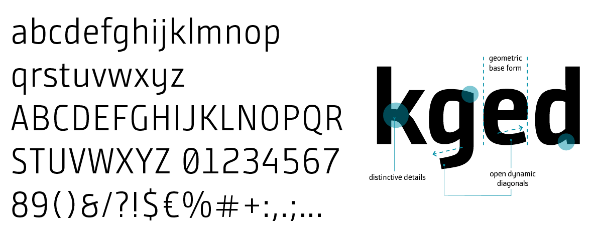
Bunday Sans – Font Family and Styles
Bunday Sans offers a broad range of weights that enable precise, clear, and flexible typographic design at INFORM.
Its balanced proportions, calm stroke flow, and modern sans-serif aesthetic support a consistent information architecture that translates cleanly across print, digital, and hybrid formats. Bunday Sans conveys technical precision without feeling cold, while remaining accessible and clearly structured.
Bunday Sans Thin
Thin is the finest and most elegant weight within the INFORM type family. Its extremely light stroke weight creates a high-quality, calm, and highly reduced appearance.
Thanks to its openness and modern geometry, Thin feels particularly refined and enables generous, airy typographic compositions that require space and visual breadth.
Thin is best suited for heroic statements, large-scale headlines, high-impact teasers and key visuals, editorial-style feature moments, and striking intro pages in presentations. In these applications, the weight unfolds its full effect – clear, elegant, and technically precise.
Usage guidelines:
- Use only at large sizes.
- Not suitable for body copy or UI.
- Do not use below 32–40 pt (print) or 40–60 px (digital).
- Prefer strong contrast backgrounds.
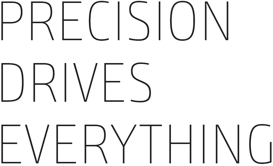
For large, calm presentations with maximum elegance.
Not suitable for small font sizes.
Bunday Sans SemiLight
SemiLight is a light, calm weight with high legibility. It conveys technical precision without harshness and creates a modern, open typographic appearance.
Thanks to its fine stroke weight, SemiLight feels particularly clear and pleasantly restrained, ideal for applications where calmness, structure, and subtle emphasis are required.
Typographically, SemiLight is well suited for intro paragraphs, lightly emphasized subheads, calm text modules, and information blocks that require high readability. The weight supports generous layouts with ample white space and integrates harmoniously into the technical aesthetic of the INFORM Design OS.
Usage guidelines:
- Ideal for paragraphs with generous white space.
- Do not use at very small sizes below 8.5 pt (print) or 13 px (digital).
- Perfect as an alternative to Regular in “light” layouts.
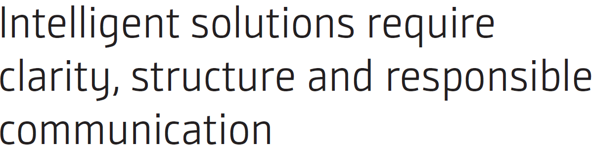
Our standard weights for body copy and longer passages.
Bunday Sans SemiBold
SemiBold represents the balanced midpoint between precision and emphasis. The weight feels clear, structured, and modern, making it ideal for visibly organizing complex information architectures. SemiBold creates strong yet non-dominant hierarchies and supports clear, easily navigable typography.
In use, SemiBold excels in subheads and section titles, UI labels and navigation structures, teaser texts, table headings, and emphasized passages within body copy. The weight feels stable and functional while remaining pleasantly restrained – perfect for applications where orientation and readability are key.
Usage guidelines:
- Excellent for digital readability.
- Ideal as a secondary headline level.
- Harmonizes strongly with Regular and SemiLight.
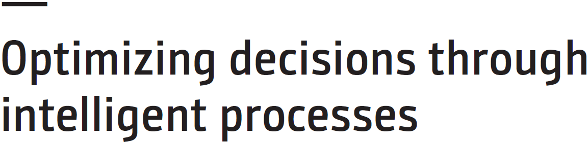
Primary weight for subheadings, UI elements, and short structural text modules.
Bunday Sans Heavy
Heavy is the most powerful weight within the INFORM typographic system. It feels bold, physically present, and carries the strongest brand messages. Thanks to its visual force, it is ideal for heroic, high-impact typography where a clear statement is the focus.
Typographically, Heavy is used wherever maximum impact is required: main headlines, campaign statements, key visual typography, large-scale trade fair and stage applications, or particularly striking presentation titles. Heavy creates visibility, generates energy, and establishes a clear focal point.
Usage guidelines:
- Use sparingly (premium mode).
- Do not use at small sizes. Heavy needs space.
- Not suitable for long text passages or UI.
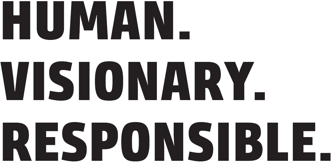
For high-impact headlines with strong brand presence.
Typographic Basic Rules
Line Spacing – For Clear, Calm Typography
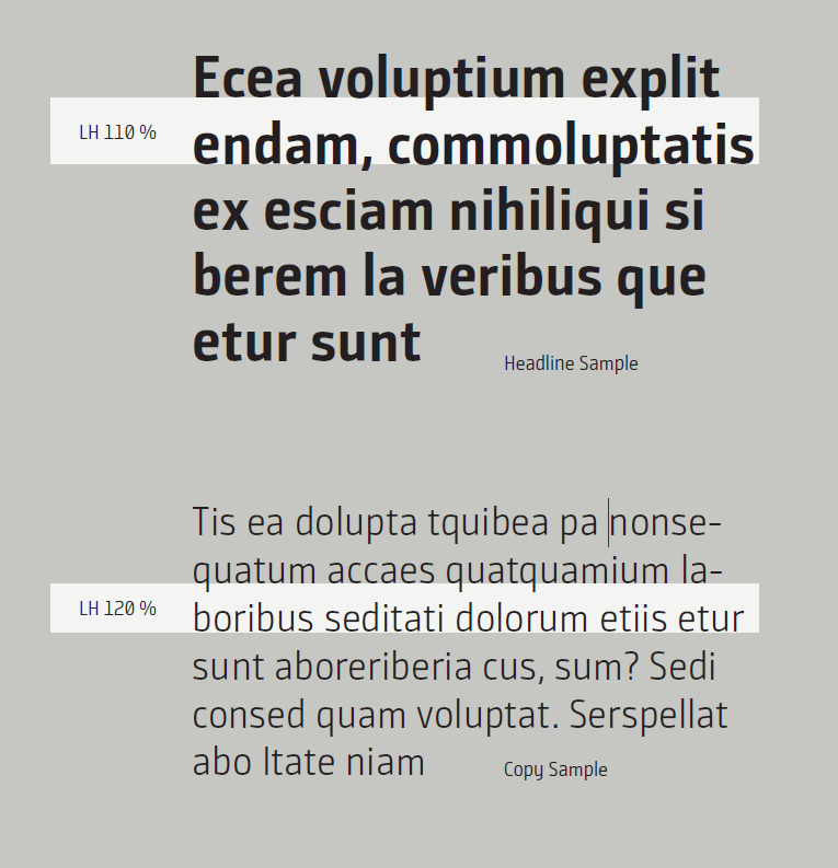
Precisely defined line spacing is essential for calm, highly readable typography. For INFORM, the following guidelines apply, based on the cap height of the chosen font size (for digital applications, px is used instead of pt):
Headlines and lead copy:
Optimal line spacing: 110 % of the cap height.
This creates a compact, confident typographic appearance and supports the brand’s clear, technical character.
Example: Font size 30 pt → line spacing 33 pt.
Body copy and captions:
Optimal line spacing: 120 % of the cap height.
This results in a calm, well-balanced reading flow with sufficient space bet-ween lines – ideal for longer texts and explanatory content.
Example: Font size 20 pt → line spacing 24 pt.
Headlines require less space to function as a cohesive unit.
Body copy benefits from increased spacing to ensure optimal readability.
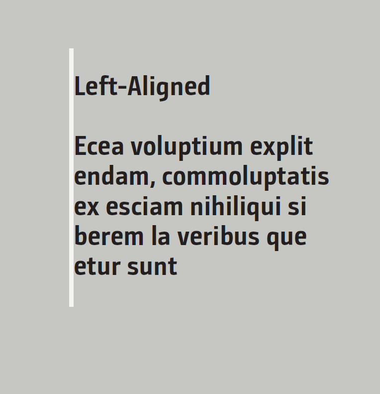
Left-Aligned – The Functional Alignment
Text alignment defines structure, rhythm, and readability. Within the INFORM Design OS, left-aligned ragged text is the primary and recommended alignment for all content-heavy text.
It ensures optimal readability, a stable and clear reading flow, and calm, technically precise typography. Natural line breaks create an orderly text image that is especially well suited for longer bodies of text.
Left alignment is used across all content areas – from body copy and captions to bullet points, editorial passages, and UI text.
Left-aligned is the functional, clear, and brand-compliant alignment within the INFORM Design OS.
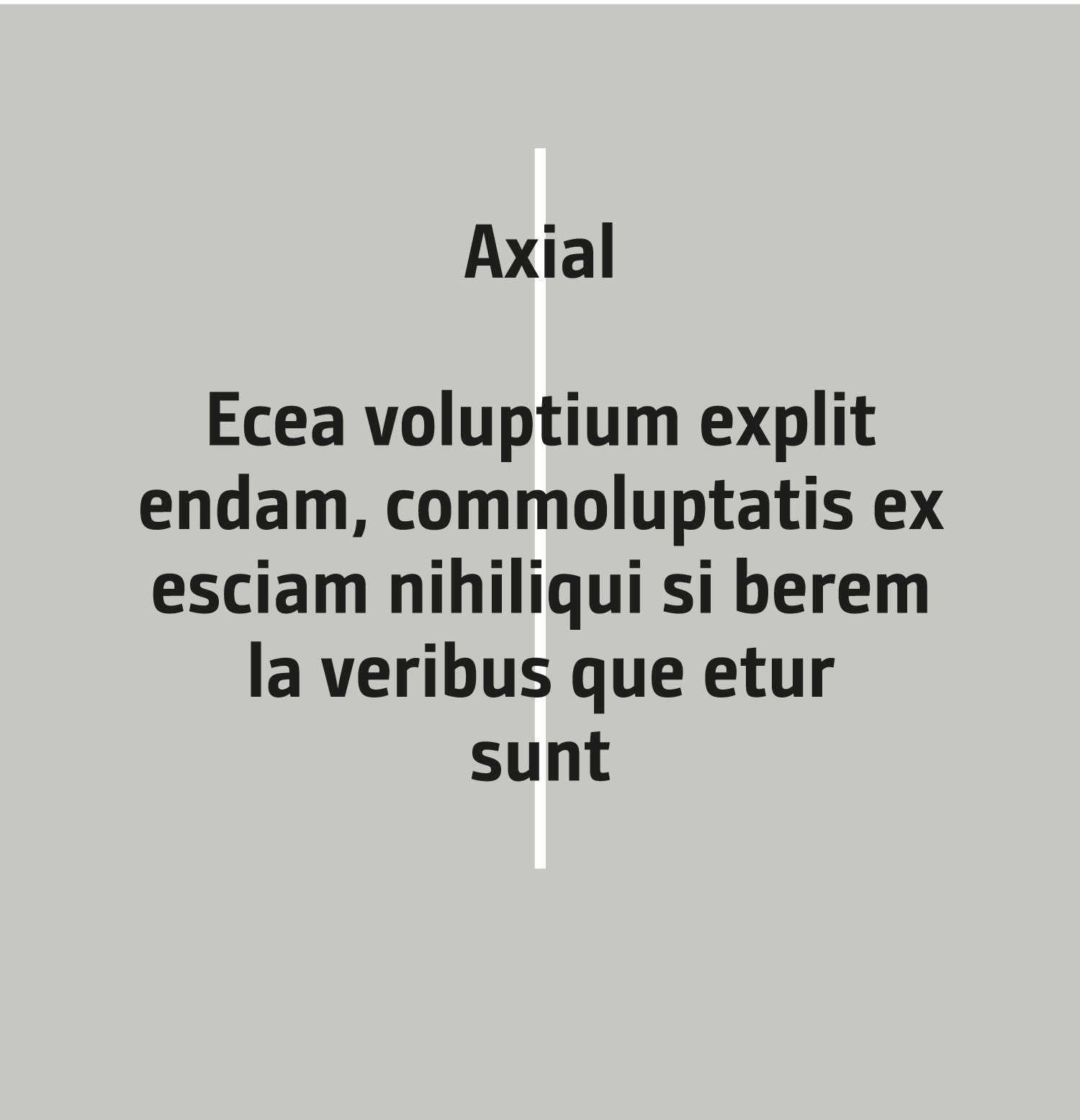
Centered – A Deliberate Staging Alignment
Centered alignment is a deliberate design choice, not an alternative to leftaligned ragged text. It is used exclusively for short, concise text modules to create a clear visual focus.
It is suitable for headlines, short statements, intro and lead texts, as well as high-impact applications such as banners, posters, or key visuals. Its symmetry creates a calm, iconic effect that intentionally places the text at the center of attention.
Centered alignment is a consciously applied staging impulse, a typographic accent for special moments, not for continuous information.
For longer paragraphs, explanatory content, or large bodies of text, centered alignment is not suitable, as it disrupts reading flow and hinders information intake.
Rule in the INFORM Design OS:
Left-aligned for content, centered for staging.
Text Alignment Rules
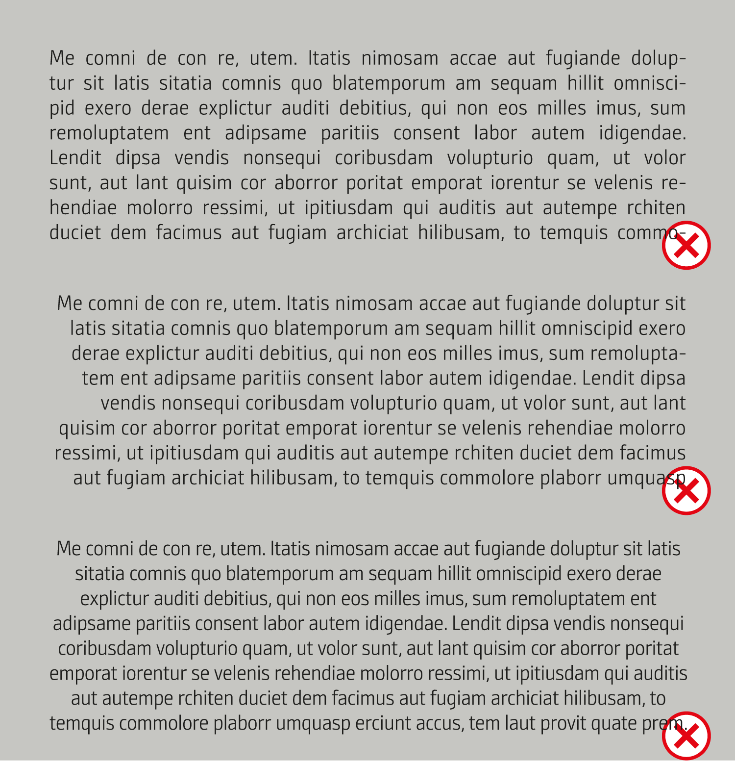
No justified text
Justified alignment is not used within the INFORM Design OS. It creates uneven word spacing, appears typographically restless, and reduces readability. The resulting gaps contradict INFORM’s clear and precise typography. In digital applications in particular, justified text intensifies these issues, leading to uncontrollable spacing, disrupted reading flow, and reduced accessibility.
No right-aligned body text
Right-aligned text disrupts the natural reading flow, makes line beginnings harder to scan, and results in unstable text blocks. Since readers consistently start from the left, right-aligned layouts create orientation gaps and significantly increase cognitive effort. For body copy, this alignment is therefore excluded – it conflicts with INFORM’s clear, structured, and usercentered
typography.
Use centered alignment sparingly and deliberately
Centered text is suitable only for short, concise text modules such as headlines, statements, or teasers. For longer paragraphs, centered alignment is inappropriate, as symmetry and irregular line lengths interrupt reading flow and undermine INFORM’s calm typographic architecture.
UI/UX: Use Left Alignment Only
Digital applications require maximum clarity, orientation, and accessible readability.
Left-aligned text is therefore mandatory in all UI/UX contexts.
It ensures:
- a stable, predictable reading start,
- clear visual hierarchies,
- better scannability across all screen sizes,
- consistent behavior in responsive layouts,
- full accessibility.
Right-aligned or centered texts in digital environments quickly lead to confusion, irregular line breaks, and poor navigability, and therefore contradict the functional, user-centered design principles of the INFORM Design OS.
Ragged-Right Remains the Brand Foundation
Left-aligned ragged text forms the typographic foundation of the INFORM Design OS. It stands for calmness, clarity, and precise reading guidance – qualities that are essential to INFORM’s attitude and visual identity.
Ragged-right alignment ensures:
- natural readability,
- harmonious line breaks,
- a balanced text appearance,
- stability across print and digital applications,
- a calm, unobtrusive information architecture.
As such, left-aligned ragged text is the standard for all body copy and structured content modules, anchoring the brand’s characteristic factual and technical tone.
Typographic Size Ratios – Clear,
Consistent Hierarchy
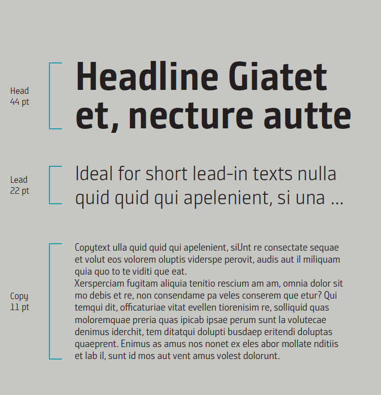
For consistent and calm typography, the INFORM Design OS uses a proportional size system in which the font sizes of individual text levels are logically derived from one another. These fixed relationships create a harmonious typographic appearance that remains stable across all media.
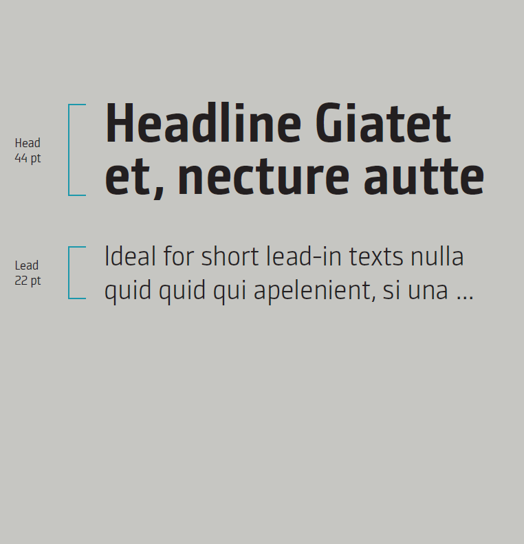
1. Headline → Lead Copy/Subline (50 % of the headline size)
Lead copy or subline is proportionally based on the headline and measures approximately half of its font size.
This keeps the hierarchy clear without creating excessive or insufficient visual distance between levels.
Example:
Headline: 44 pt
Lead copy/Subline: 22 pt
This proportion ensures the subline feels clearly guided yet not dominant – ideal for clear brand communication.
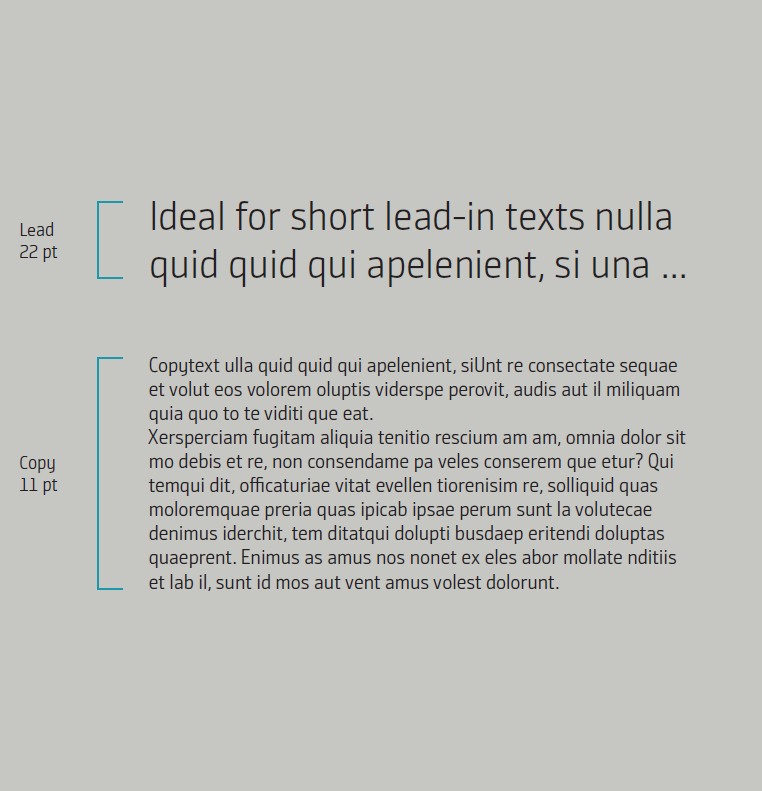
2. Subline → Body Copy (50% of the subline size)
Body copy is derived proportionally from the subline and measures approximately half of its font size.
This creates a calm, modern structure in which each text level is clearly defined.
Example:
Subline: 22 pt
Body copy: 11 pt
This ratio ensures optimal readability and a clear structure in longer content.
3. Why These Proportions?
Visual harmony:
The size relationships create a balanced and cohesive overall appearance.
Clear information flow:
Users instantly recognize what is headline, subline, and body copy.
System stability:
All layouts are based on the same proportional logic.
Scalability:
Whether presentation, website, or print, the proportions work everywhere.
Hierarchy emerges automatically and consistently.
Short formula:
Lead copy = ½ headline
Body copy = ½ lead copy
Headlines – Character Count and Weights
The character count of headlines is generally flexible, but should not exceed 70 characters including spaces. Shorter headlines feel more precise and powerful, and support INFORM’s clear, calm brand aesthetic.
Headline font size depends on the amount of text, the medium (print, digital, presentation), and the desired level of staging.
There is no fixed font size for headlines. What matters is a balanced relationship between headline, lead copy, and body copy.
In the defined media and assets within the SPINE area, appropriate font sizes are already systematically preset. This ensures headline hierarchies, proportions, and visual balance are automatically maintained, regardless of the communication format used.
These presets create consistent typography across all applications and provide a reliable foundation for daily use.
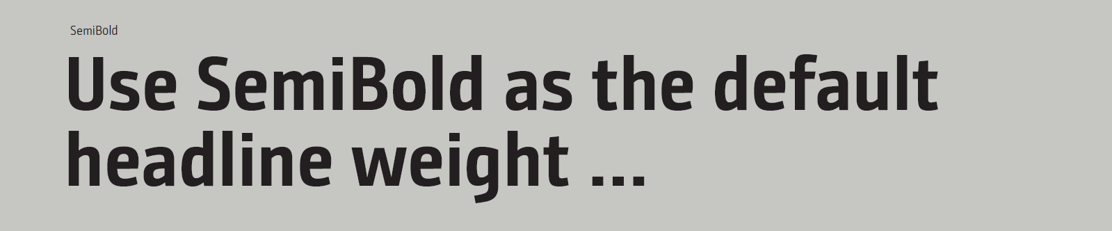
Primary weight – SemiBold:
SemiBold is the standard weight for headlines. It offers the optimal balance
of impact, technical clarity, and readability.
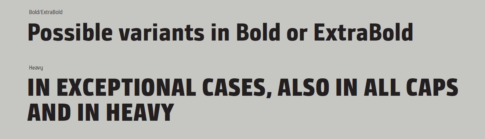
Optional – Bold/ExtraBold:
These weights are suitable for strong visual accents, poster-style applications, and heroic or high-impact layouts.
Both variants retain the brand’s characteristic tone while increasing visual presence.
Exception – All Caps or Heavy:
In justified, rare cases, headlines may also be set in all caps or in the Heavy weight.
This is reserved exclusively for staged, highly distinctive statements and must be used sparingly to avoid undermining system stability.
Lead Copy – The Connecting Layer Between Headline and Body Copy
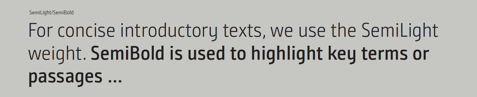
Lead copy is the introductory text that complements the headline and guides the reader into the topic. Typographically, it sits clearly between headline and body copy and forms the connecting layer of the information hierarchy.
Within the INFORM Design OS, lead copy is set in SemiLight; emphasized words or passages may be highlighted in SemiBold.
The font size is typically about half the size of the headline, with line spacing between 110 % and 120 % of the cap height.
In terms of content, lead copy remains short, precise, and focused. It provides orientation, clarifies the core message, and prepares the entry into the body text.
Typographically, lead copy is always left-aligned in ragged-right alignment to ensure calmness and readability. Through its clear positioning in the layout, lead copy plays a key role in INFORM’s structured and modern typographic architecture.
Body Copy – The Foundation of Our Content Communication
Body copy forms the fundamental text level within the INFORM Design OS and serves the clear, factual communication of content. Typographically, it sits below headline and lead copy and carries the main body of information.
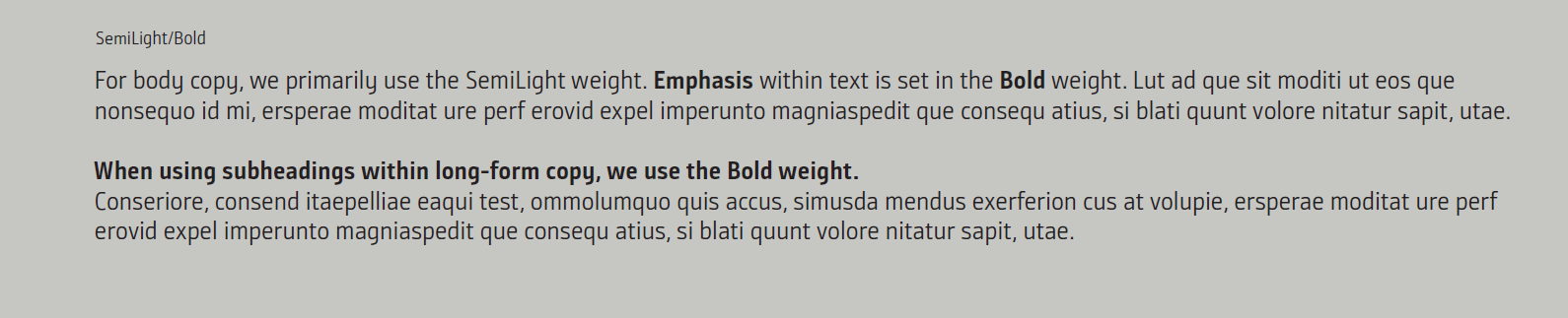
For running text, we primarily use the SemiLight weight. It ensures a calm, highly legible, and technically precise appearance that aligns with INFORM’s character.
The font size of body copy is typically around half the size of the lead copy. Line spacing is set at approximately 120 % of the cap height, ensuring optimal readability and a calm, balanced text image.
Body copy is always set left-aligned in ragged-right alignment, as this is the clearest, most user-friendly, and most accessible form of text presentation.
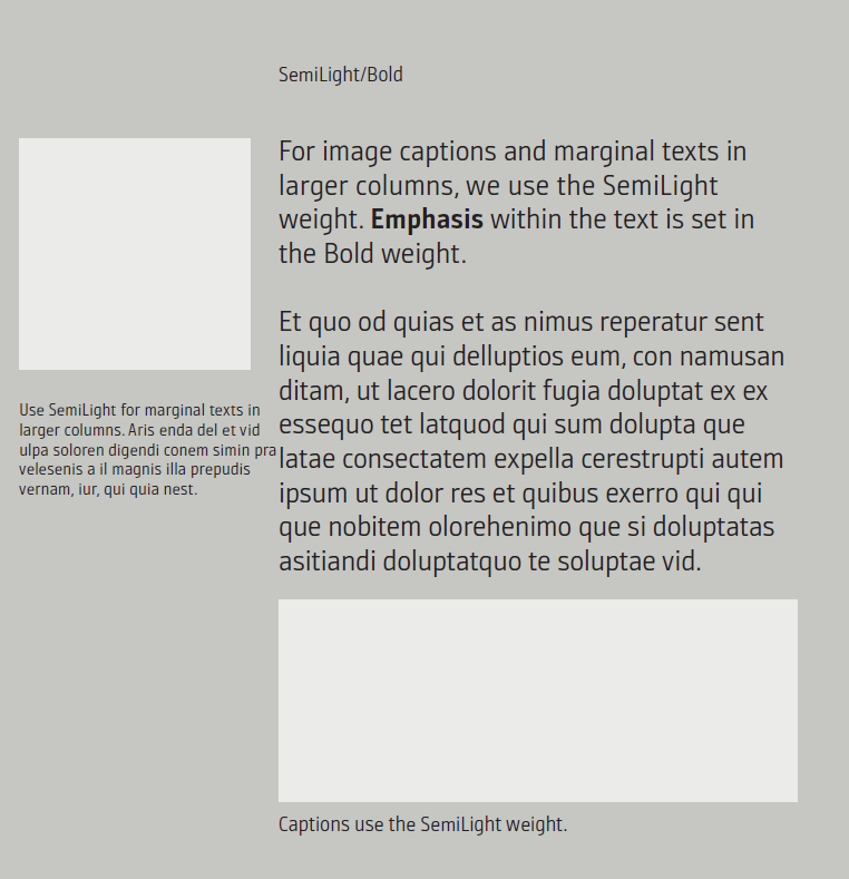
Emphasis within a paragraph – such as highlighting individual terms or short phrases – is consistently set in Bold. This creates clear visual weighting without overloading the typography.
If structural subheadings are used within long-form copy, they are also set in Bold. They structure longer texts, improve orientation, and strengthen typographic hierarchy without competing with the primary headline level.
Captions – Image Captions and Marginal Texts
Captions provide short, functional explanations for images, graphics, or supplementary information. Typographically, they sit below the body copy and must remain highly legible, even at smaller sizes.
At INFORM, captions are set in SemiLight.
This weight creates a calm, clear, and restrained tone that does not compete with the image content.
Emphasis within captions is applied exclusively in Bold, allowing key terms or source references to stand out clearly without compromising readability.
The font size is chosen slightly smaller than body copy, depending on the medium, but always large enough to remain clearly readable – even in complex layouts or on dark imagery.
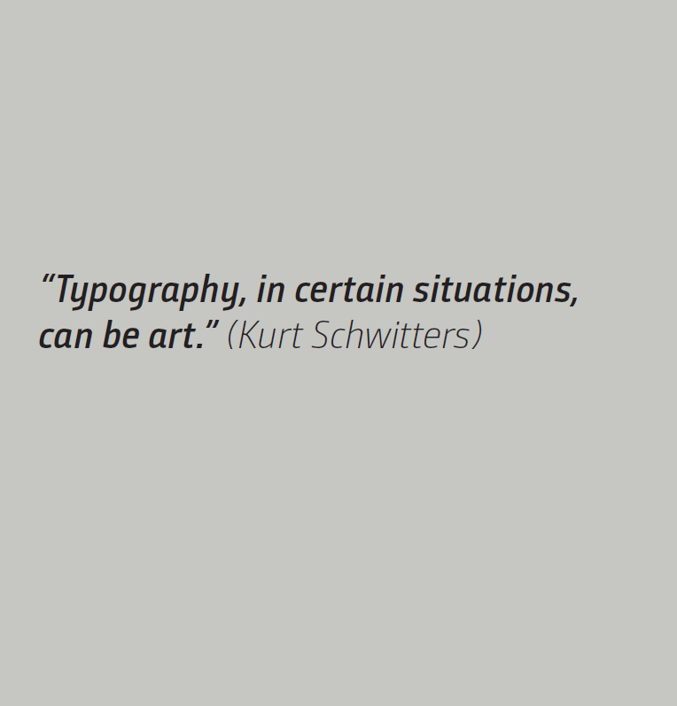
Italic – Use for Quotes and Special Text Types
INFORM does not use italics decoratively.
Italic is applied strictly for functional purposes as a stylistic marker for:
- quotes,
- works, references, or sources,
- foreign-language terms that require typographic distinction,
- distinct voices (e.g. typographically highlighted statements
Italic is therefore not a design element, but a semantic marker. It is used sparingly to preserve its role as a clear visual voice.
Spacing Between Image and Text
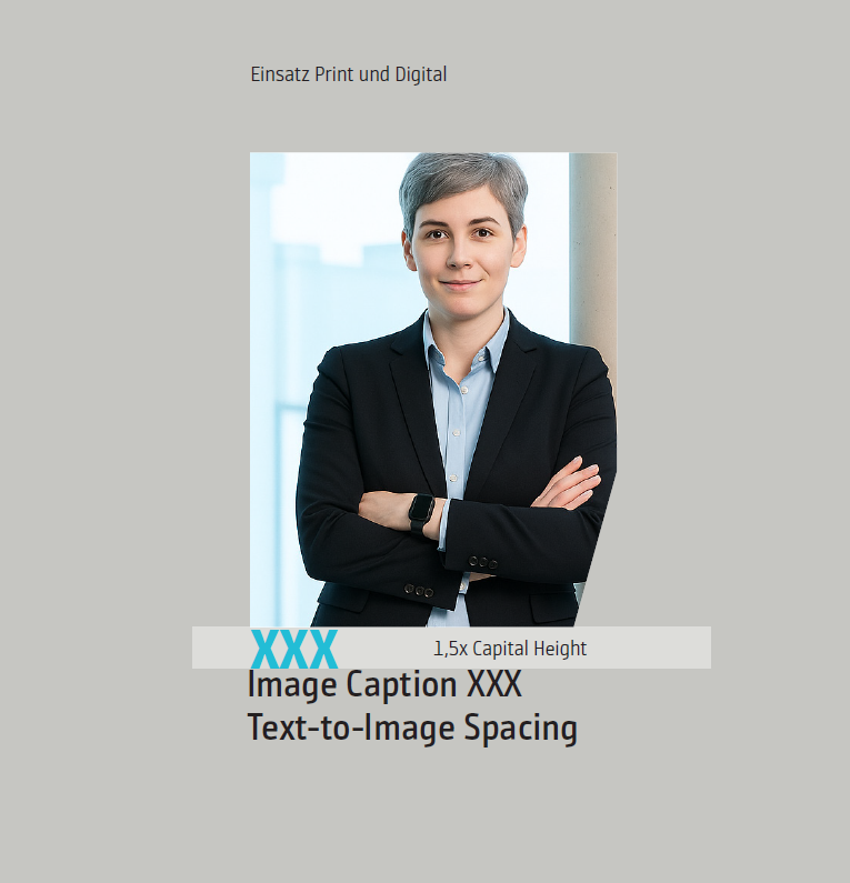
The spacing between an image and its associated text is always 1.5 times the cap height of the text size used.
This defined spacing ensures a calm, orderly layout and creates a clear visual separation between imagery and typography. By referencing the cap height, the spacing scales harmoniously with the font size and integrates consistently into every application of the INFORM Design OS.
Use of Type Colors
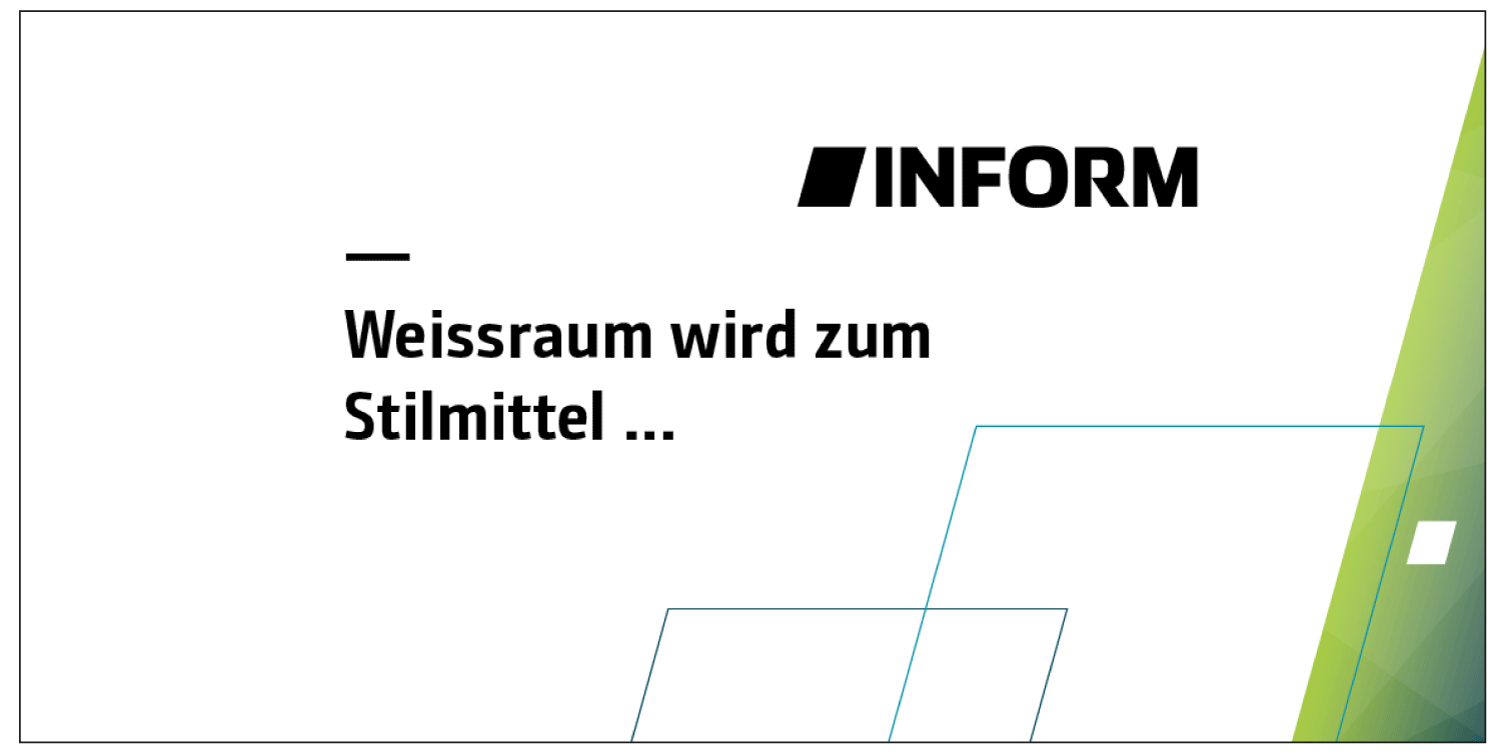
Within the INFORM Design OS, text color is always determined by background contrast. On light backgrounds, text is consistently set in black to ensure maximum legibility and a calm, clear typographic appearance.
On dark backgrounds or in imagery with low brightness, white text is used so that all content remains clearly readable and visual hierarchy is preserved.
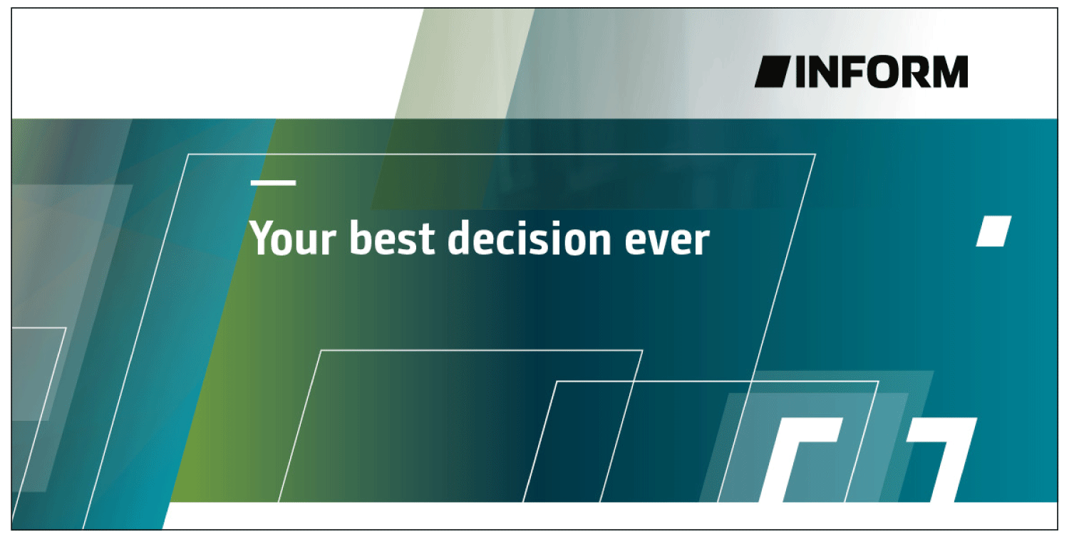
The choice of text color always serves readability, accessibility, and functional clarity. Colors from the extended palette are not used for body copy or headlines, but only in clearly defined exceptions (e.g. charts or UI labels).
Note:
The illustrated examples demonstrate how black and white are applied across different backgrounds to ensure optimal reading guidance.