
Brand Colors
Identity through clarity, precision, and further development
INFORM’s color scheme is a central component of our visual identity. It ensures recognition, differentiation, and a consistent brand presence. At its heart is our signature color Teal, the brand’s strongest visual anchor. It characterizes both print and digital applications and conveys INFORM’s core values: expertise, precision, and technological depth.
Teal is complemented by Blue Teal, Black, and White, our defined core colors. Black and white serve as stable contrast colors, while blue petrol adds depth and design versatility. Our color scheme is supported by selected accent colors, such as a fresh green, as well as defined gradients that add vitality, depth, and a modern visual tonality. They expand our design spectrum and create a flexible yet clearly defined atmosphere.
As part of a living system, the color palette is precisely defined while remaining open to targeted extensions. New color tones may be introduced if they meaningfully support functional requirements, new formats, or stylistic development. Such extensions are anchored in the FLOW area of the Design OS.
Teal – Character and effect of our primary color
Petrol is INFORM’s signature color and the strongest visual anchor of our brand. The shade stands for competence, precision, and technological depth – key characteristics that INFORM conveys in all media.
As a deep, cool shade between green and blue, petrol embodies calm, stability, and clarity. Its natural depth is reminiscent of ocean tones and atmospheric evening moods, lending the appearance a modern, focused serenity.
In design applications, petrol blue appears elegant, technical, and timeless without losing its conciseness. The color creates optical depth, strengthens the visual structure, and makes surfaces appear orderly and high-quality. Even outside of corporate design, petrol blue is considered a confident, modern tone with a clear character effect and high combinability—qualities that directly translate to the brand image of INFORM.
As a signature color, teal combines freshness without dominance: it appears strong without being loud—precise without appearing cool—and balances INFORM between economic clarity and visual modernity. Through consistent use in all print and digital applications, petrol ensures recognizability, a clear brand attitude, and an unmistakable visual presence.
The Primary Colors – The Foundation of Our Visual Identity
The core colors INFORM Teal, Blue Teal, Black, and White form the color foundation of our brand. They carry the central visual identity and communicate trust, clarity, and professionalism. Together, they create a precise, technically modern appearance that makes INFORM’s stance instantly visible.
These core colors function as the visual baseline of the brand. They set the tone for the entire design system, structure visual perception, and ensure a consistent brand presence across all channels. Black and white serve as stable contrast and functional colors, supporting the strength of the petrol tones and ensuring legibility in every format.
Through consistent use in print and digital media, the core colors create strong recognition. The palette ensures coherence in the overall appearance, strengthens brand identity, and clearly differentiates INFORM from the competition. It is therefore not just an aesthetic choice, but a strategic tool in brand management.
LemonGreen – A Clearly Defined Accent Color
Complementing the core colors INFORM Teal, Blue Petrol, Black, and White, Lemongreen extends the color world with a fresh, vibrant accent tone. It adds energy, dynamism, and lightness to the design and is used selectively to highlight content or introduce visual impulses.
As an accent color, Lemongreen supports the core colors without competing with them. It creates clear hierarchies, increases design flexibility, and remains firmly anchored within INFORM’s color space. Especially in infographics, diagrams, UI cues, or supporting elements, Lemongreen draws attention without becoming visually dominant.
Usage rule:
Lemongreen must not be used as a standalone background color. It unfolds its effect exclusively in combination with defined gradients or within secondary, supporting elements that reinforce the core colors.
This keeps the accent refined, controlled, and clearly embedded within the system, without compromising the visual stability of the brand.
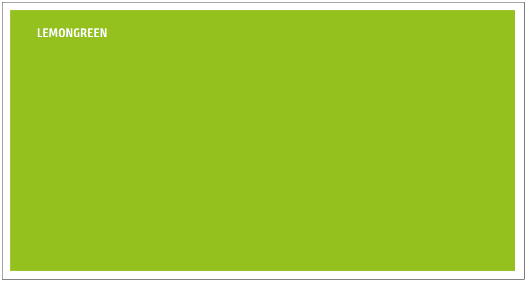
Anwendungsfarben – funktionale Erweiterung für Infografiken
For specific use cases such as charts, infographics, or PowerPoint presentations, the color world is extended with defined application colors. These include Dark Teal, Hilite Teal, and Passepartout. They selectively expand the core palette wherever additional differentiation, structure, or clarity is required.
The application colors:
- create visual variety without diluting the brand identity,
- support hierarchy and accentuation in complex representations,
- increase contrast and legibility, especially in data-driven graphics,
- ensure consistent recognition across different media.
They function as practical tools within the Design OS – clearly defined, precisely applied, and always aligned with INFORM’s core brand personality.
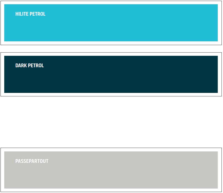
Color Gradients – Dynamism, Atmosphere, and a Modern Brand Presence
INFORM’s color scheme is complemented by defined color gradients that add modern, atmospheric depth to the brand. They create soft transitions, open up creative space, and shape the brand’s visual tone.
The two-step and three-step gradients are based exclusively on the brand’s core and accent colors. This keeps them precisely anchored within INFORM’s color space and ensures they integrate systematically. They are primarily used in heroic, expressive, or image-driven applications, where they break up surfaces, elevate content atmospherically, and add visual depth to the layout.
Gradients also support evolutionary design elements such as the frame, the focal bracket, strengthening their visual impact.

Technical Notes on Creating Color Gradients
To create a two-color gradient, use the appropriate gradient tool in your design software (e.g. Gradient Tool). Define the two colors to be blended, then set the gradient direction – horizontal, vertical, or – depending on the desired visual effect and surface flow.
In digital gradients, unwanted banding can occur, especially on larger areas. This effect is caused by tonal breaks between color steps that are too close together.
To reduce banding, a subtle noise of approximately 1–2% can be added to the gradient. This softens hard transitions and visually blends the color steps.
Note: In print files, this added noise may cause very light areas to appear slightly darker or mildly grainy. Usage should therefore be evaluated individually and applied with care depending on the motif.
For professional applications, the following is recommended:
- Always create gradients with high color depth (at least 16 bit).
- Do not compress gradients (e.g. JPEG), as compression increases banding.
- For UI and digital formats, prefer SVG or PNG exports, as they render gradients more cleanly.
- For large layout areas, adjust the gradient scale consciously to avoid any hard transitions.
A technically correct gradient ensures that INFORM’s color world appears clean, high-quality, and free of artifacts across all media.
Example: Horizontal Two-Color Linear Gradient

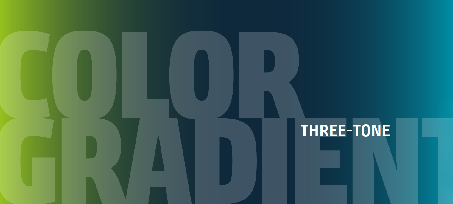
Three-Tone Gradients
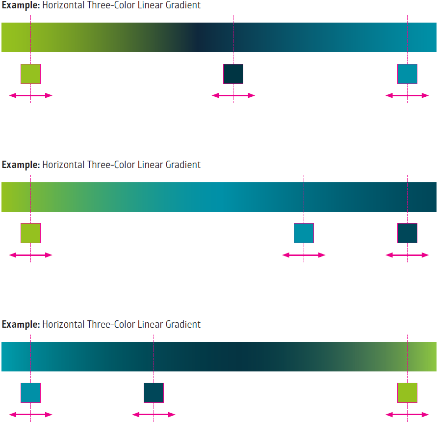
Three-tone gradients expand visual depth and create softer, more complex transitions than two-step variants. They are built on a defined sequence of three brand colors and are designed so that all transitions blend harmoniously without visual breaks.
The additional color stop allows larger surfaces to feel more dynamic, enhances atmospheric effects, and effectively supports evolutionary elements such as the frame, the focal bracket, or ICONIC MODE.
As with all gradients, three-color gradients must remain clearly anchored within INFORM’s color space and be technically constructed with care to avoid banding and ensure a high-quality appearance.
Color values
Teal
CMYK
100 | 000 | 030 | 010
RGB
000 | 144 | 167
HEX
#0090a7
PANTONE®
7711 C
Blue Teal
CMYK
100 | 000 | 015 | 070
RGB
000 | 069 | 089
HEX
#004559
PANTONE®
548
Lemon Green

CMYK
050 | 000 | 100 | 000
RGB
149 | 193 | 031
HEX
#95c11f
PANTONE®
382
Light Teal

CMYK
068 | 000 | 016 | 000
RGB
034 | 189 | 214
HEX
#22BDD6
PANTONE®
310
Dark Teal
CMYK
100 | 064 | 048 | 052
RGB
000 | 053 | 067
HEX
#003543
PANTONE®
5463
Passe-partout

CMYK
025 | 019 | 022 | 002
RGB
198 | 198 | 194
HEX
#C6C6C2
PANTONE®
7535