The Primary Logo
Structure and Character
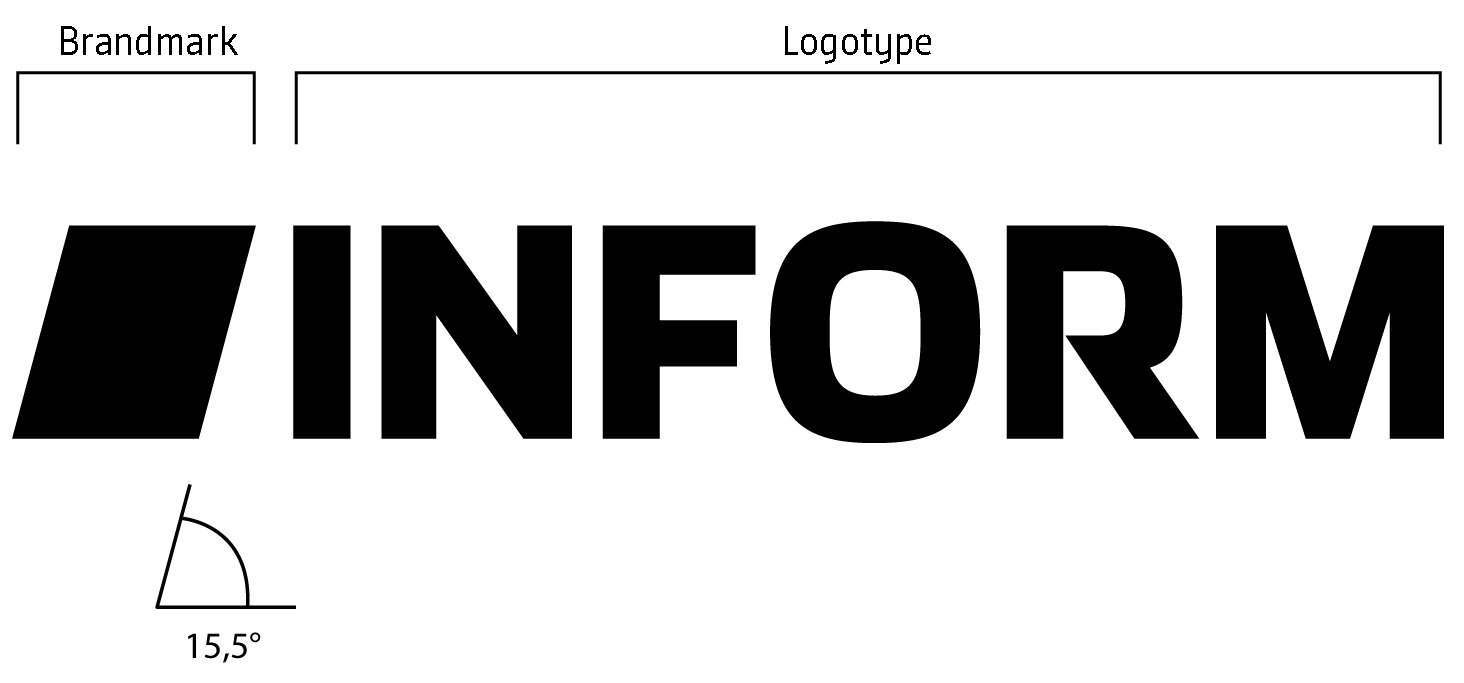
The INFORM logo consists of two elements: the brand mark (rhomboid) and the word mark (logotype). Both components form a monochrome, stable unit that is set in fixed proportions and may not be altered.
The combination of a distinctive figurative mark and a clear word mark ensures a precise, modern, and recognizable brand image. The single-color design increases flexibility in use and ensures that the logo appears strong, sharp, and consistent across all media, both digital and analog.
The interplay of both elements opens up new possibilities in daily use: depending on the context, the brand mark can be used as a concise, minimalist icon, while the full logo combination provides a strong sender identity.
Use and Implementation
The Constant Signature of our Brand
The logo achieves its full effect through consistent and deliberate use. It is not only a recognizable symbol, but also becomes the defining emblem of the INFORM brand.
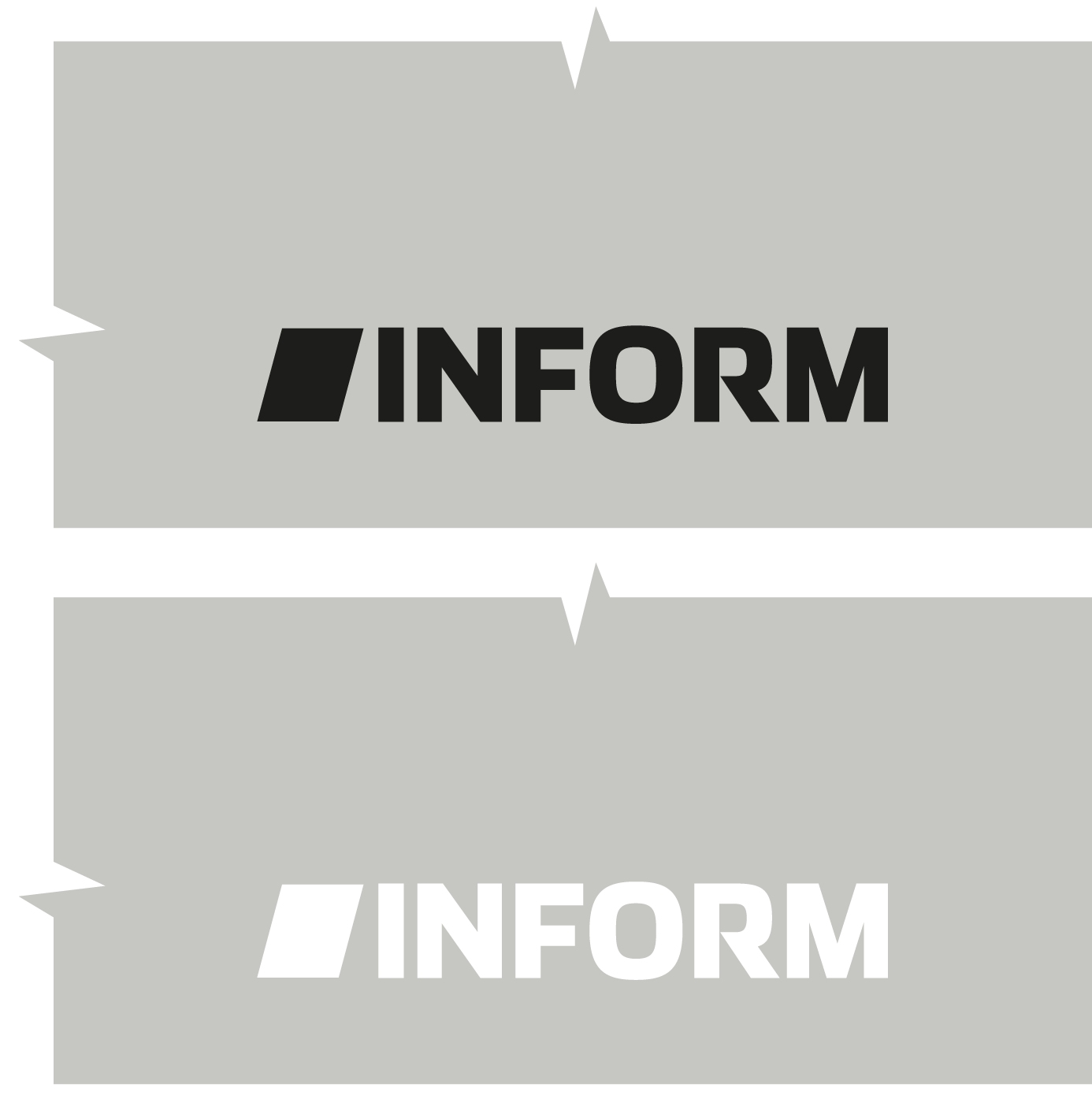
The primary logo exists in two versions: black and white (negative).
The black version is the preferred primary option and should be used whenever possible.
The white version is only used when the background does not ensure sufficient legibility of the black logo. Further guidance can be found in the section “Use on Backgrounds.”
Size and Clear Space
To ensure the INFORM logo remains legible, clear, and authentic at all times, a defined clear space is required.
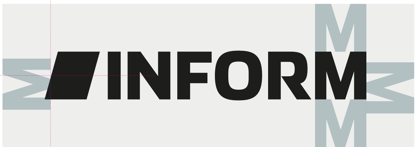
This clear space corresponds to at least the height of the straight uppercase letters (I, N, F, or M) and must be maintained as a minimum distance from all other design elements, images, or text.
The spacing in relation to the angled edge of the brand mark is aligned via the center of the rhomboid. This creates a visually balanced protected area around the logo.
The clear space serves as a safety margin to prevent visual interference and to preserve the logo’s impact across al applications.
In addition, a minimum width of 10 mm applies. This minimum size ensures the logo is reproduced cleanly and remains fully legible across all media.
Minimum Logo Width
Print: 10 mm
Digital: 38 px
Logo in BrandFrame –
Flexible, clear, and context-sensitive
For use within BrandFrame, both versions – black and white – are equally valid. The choice is consistently based on legibility, contrast, and the specific design context.
The BrandFrame creates a defined, stable space for the logo.It ensures that both black and white work reliably across all media and are perceived as clear brand identification.
What matters is that:
- legibility is optimal at all times,
- contrast with the surrounding layout is well balanced,
- the logo is applied functionally, precisely, and unambiguously.
The BrandFrame therefore offers maximum flexibility without altering the logo system itself. Black and white are equally valid options. The choice depends on context, not on a fixed hierarchy.
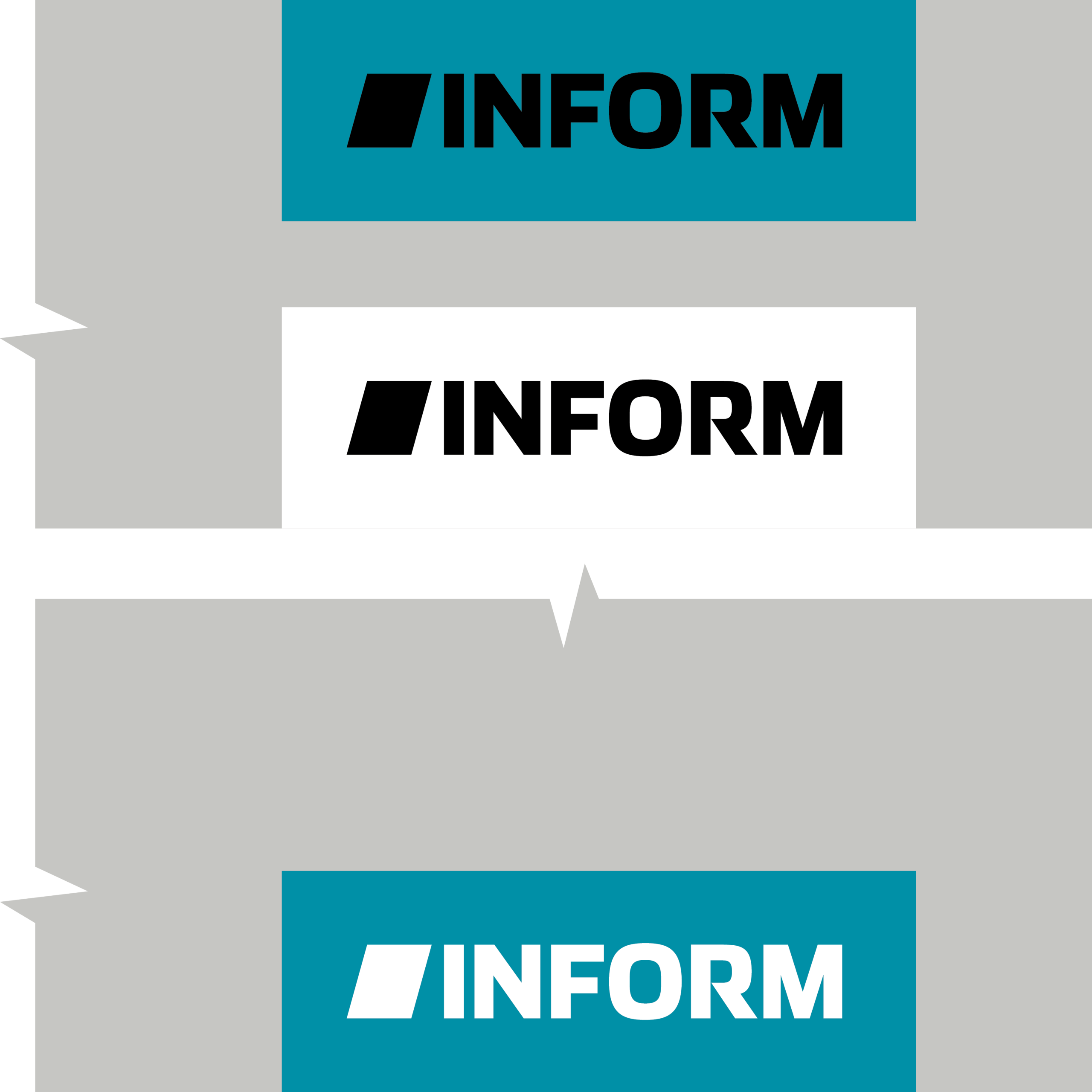
Logo in BrandFrame –
Spacing and Minimum Size
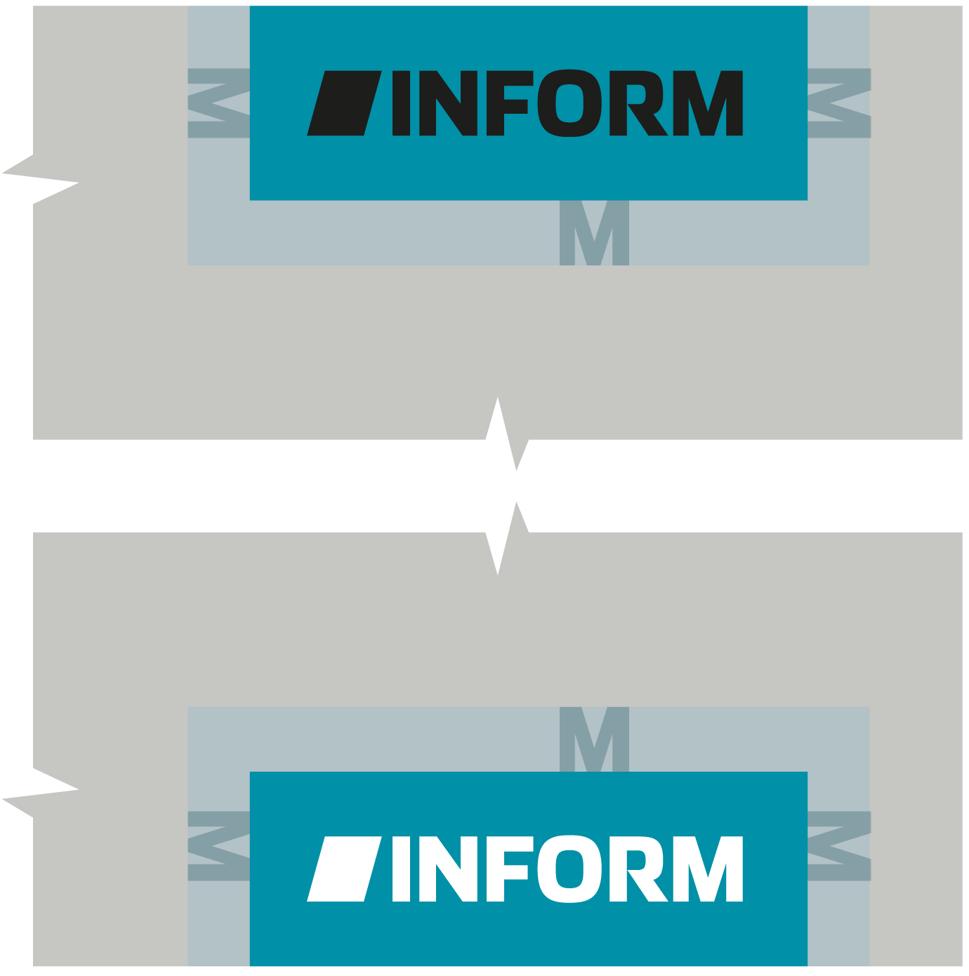
The BrandFrame is always anchored to one side of the layout. On the open sides around the logo within the brand area, the same clear space applies as to the logo alone.
The distance to other design elements, images, or text must be at least equal to the height of the uppercase M in the logotype. These zones prevent visual collisions and protect the logo’s impact within the overall layout.
Here, too, the logo in the BrandFrame must not fall below a minimum width of 10 mm in order to ensure legibility and technical accuracy across all applications.
With a minimum BrandFrame width of 14 mm, the logo’s readability is guaranteed in all use cases.
Minimum Brand Area Width
Print: 14 mm
Digital: 50 px
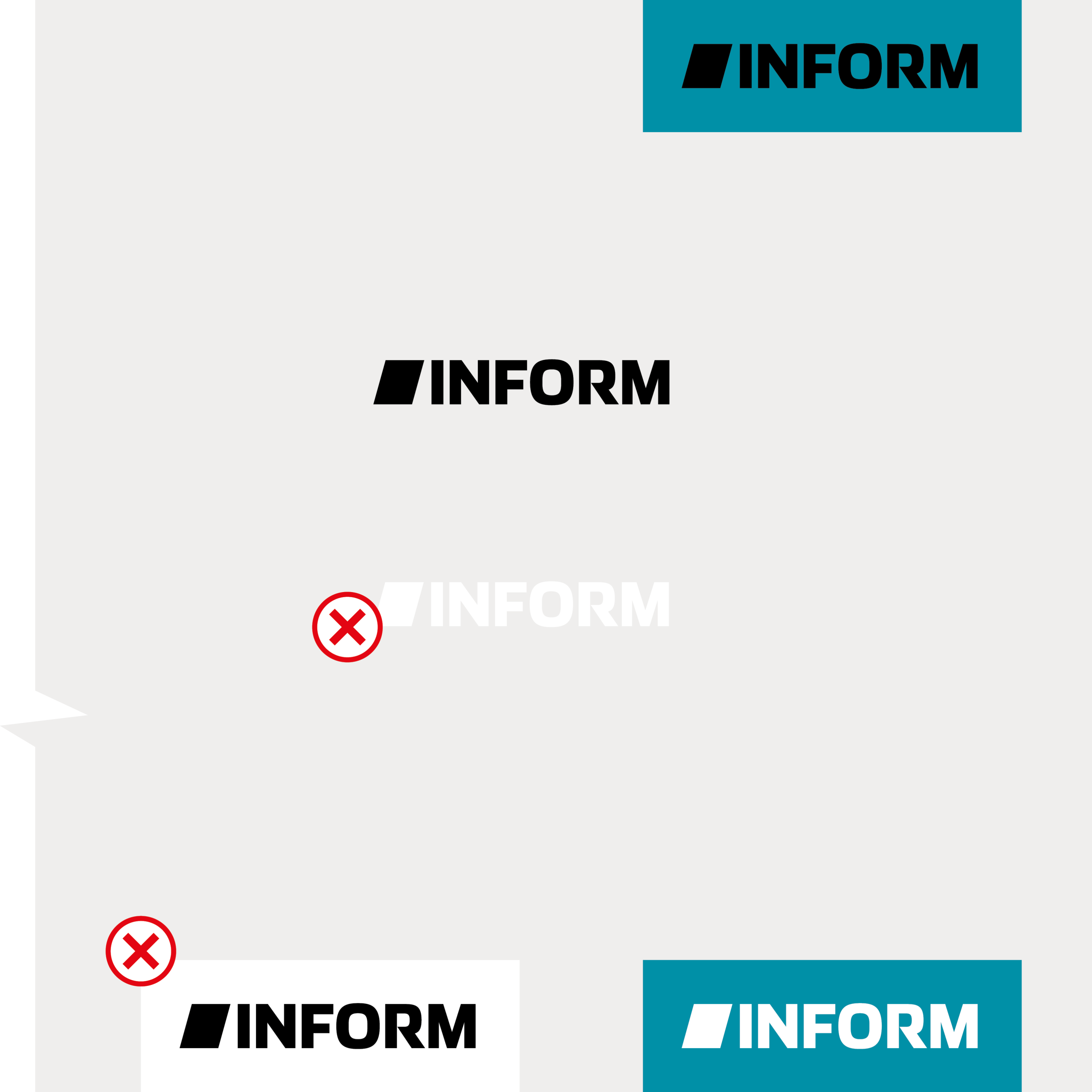
Use on Light Backgrounds
To ensure clear legibility, the contrast between the logo and the background must always be checked and optimized if necessary.
The black logo (primary logo) is freely positioned on light backgrounds in compliance with the defined clear space as well as the minimum distance to the edge of the format and to other non–CD-compliant elements (e.g. external logos, diagrams, icons, etc.).
When used in the BrandFrame, the logo is anchored at the top or bottom. Along these two axes, it may move freely toward the side edges of the format – while maintaining a minimum lateral distance equivalent to one uppercase M.
The white logo variant is not used on light backgrounds, as the necessary contrast for barrier-free legibility is not given.
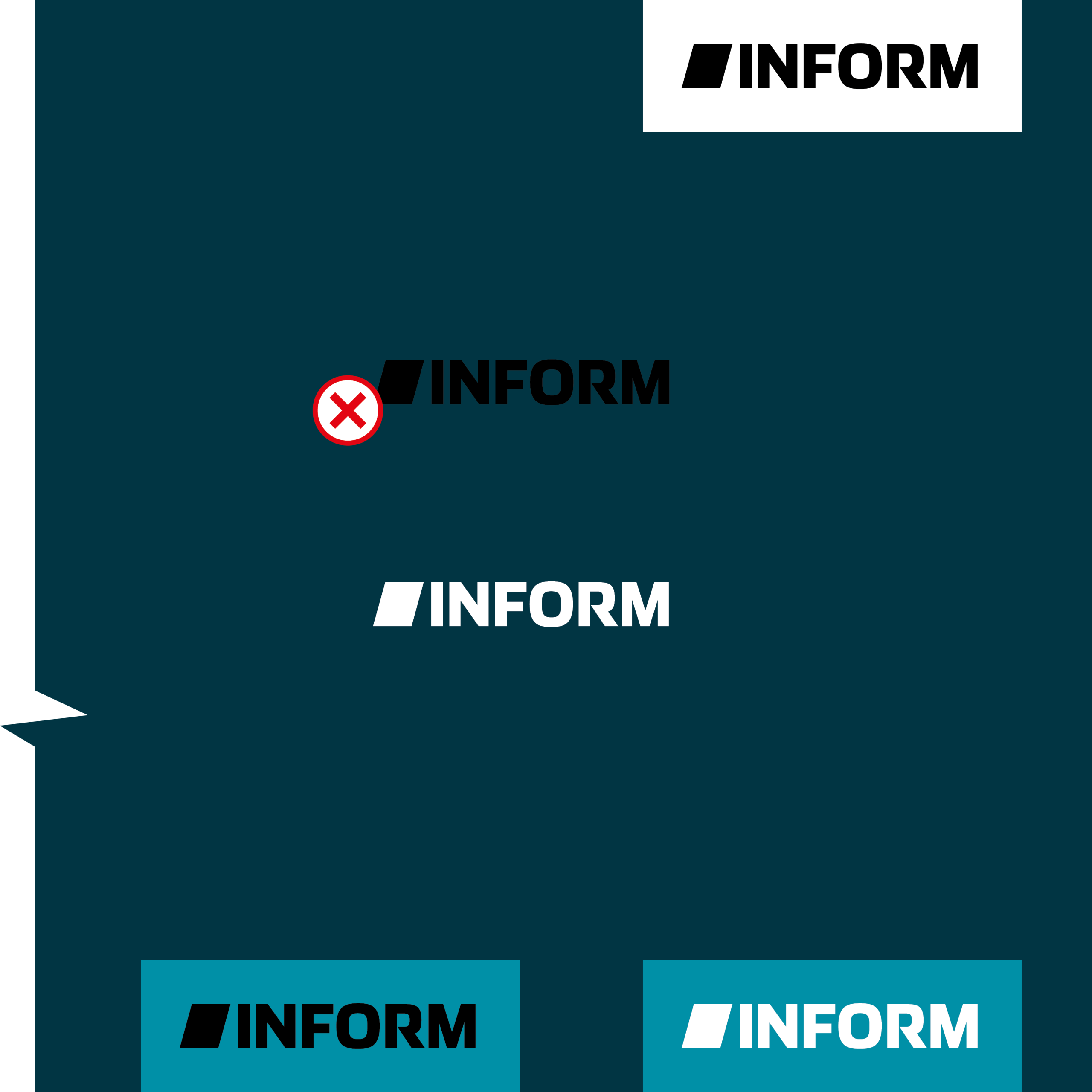
Use on Dark Backgrounds
To ensure clear legibility, sufficient contrast between the logo and the background must be verified and maintained.
The white logo (negative) is freely positioned on dark backgrounds in compliance with the defined clear space as well as the minimum distance to the edge of the format and to non–CD-compliant elements (e.g. external logos, diagrams, icons, etc.).
When used in the BrandFrame, the logo is anchored at the top or bottom. Along these axes, it may move freely toward the side edges of the format – while maintaining a minimum lateral distance equivalent to one uppercase M.
The black logo is not used on dark backgrounds, aas the necessary contrast for barrier-free legibility is not given.
Use on Complex Image Backgrounds
On busy or complex image backgrounds, the legibility and clarity of the logo is paramount. Image contrast must therefore always be checked and adjusted if necessary.
Both the black and white versions can freely be positioned on image backgrounds in compliance with the defined clear space, the minimum distance to the format edge, and to other non–CD-compliant elements (e.g. external logos, diagrams, icons, etc.).
The choice of color is determined by which option provides the best possible contrast to the image motif.
When used in the BrandFrame, the logo is anchored at the top or bottom. Along these axes, it may move freely toward the side edges of the format – while maintaining a minimum lateral distance equivalent to one uppercase M.

Use on Color Gradients

When using color gradients, consistent logo legibility is the top priority. Since gradients contain varying levels of brightness and color, contrast must be checked across the entire surface.
Both the black and white logo can be freely positioned on gradients in compliance with the defined clear space as well as the minimum distance to the format edge and to other non–CD-compliant elements.

The choice of color is based on the dominant brightness of the gradient:
predominantly light gradients → black logo
predominantly dark gradients → white logo
The logo must not be placed across sharp brightness changes or distinct gradient edges, as this impairs legibilit
Use on Complex or Low-Contrast Gradients

On color gradients with low differences in brightness or high visual complexity, the logo’s legibility can quickly be compromised.
In these situations, the BrandFrame provides a reliable solution. It creates a clearly defined, stable space around the logo and preserves its impact regardless of the background’s structure, color, or motion.
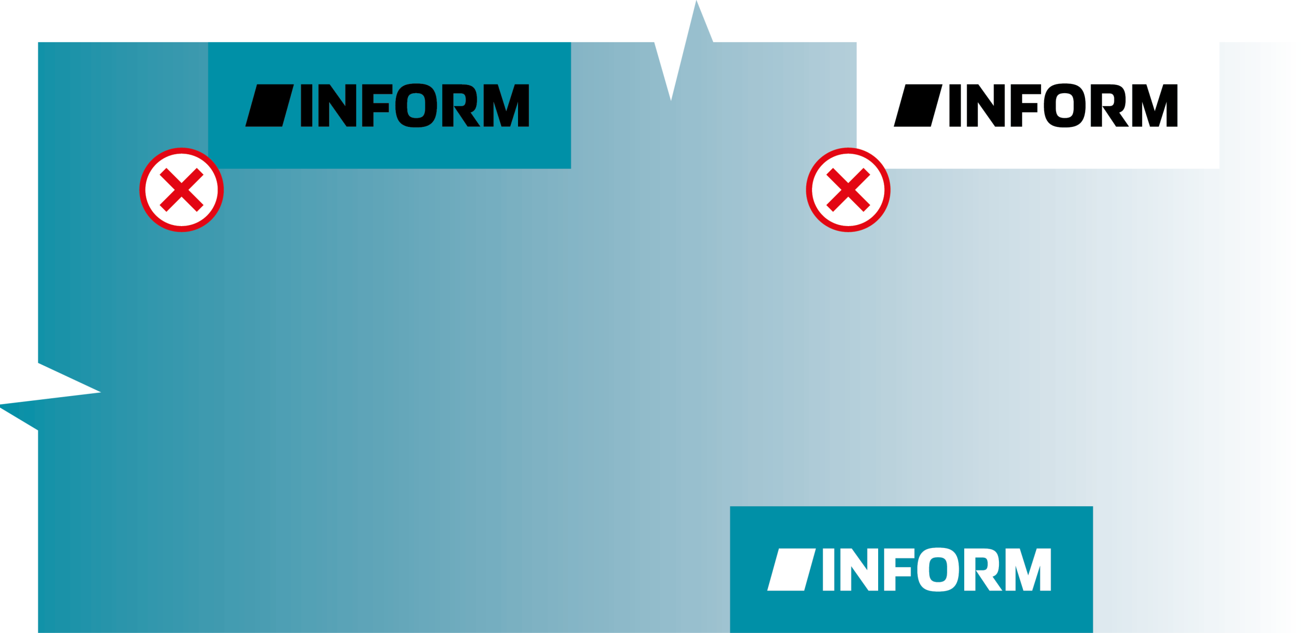
The BrandFrame prevents gradient elements from competing with the wordmark or brand mark and ensures the sender is perceived clearly and accessibly. It may be anchored at the top or bottom of the layout and positioned freely along these axes, while maintaining a minimum lateral distance equivalent to one uppercase M.
This keeps the logo precise, legible, and clearly recognizable even on complex or dynamic backgrounds. The BrandFrame acts as a constant anchor within the layout and guarantees consistent brand perception across
all media.
DON’Ts – What Is Not Allowed
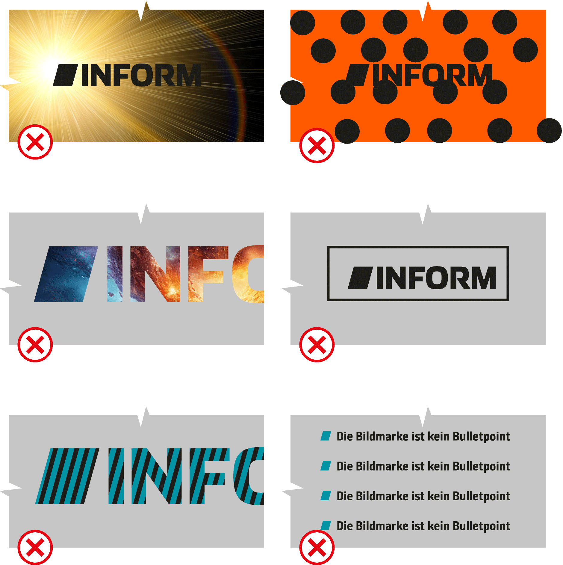
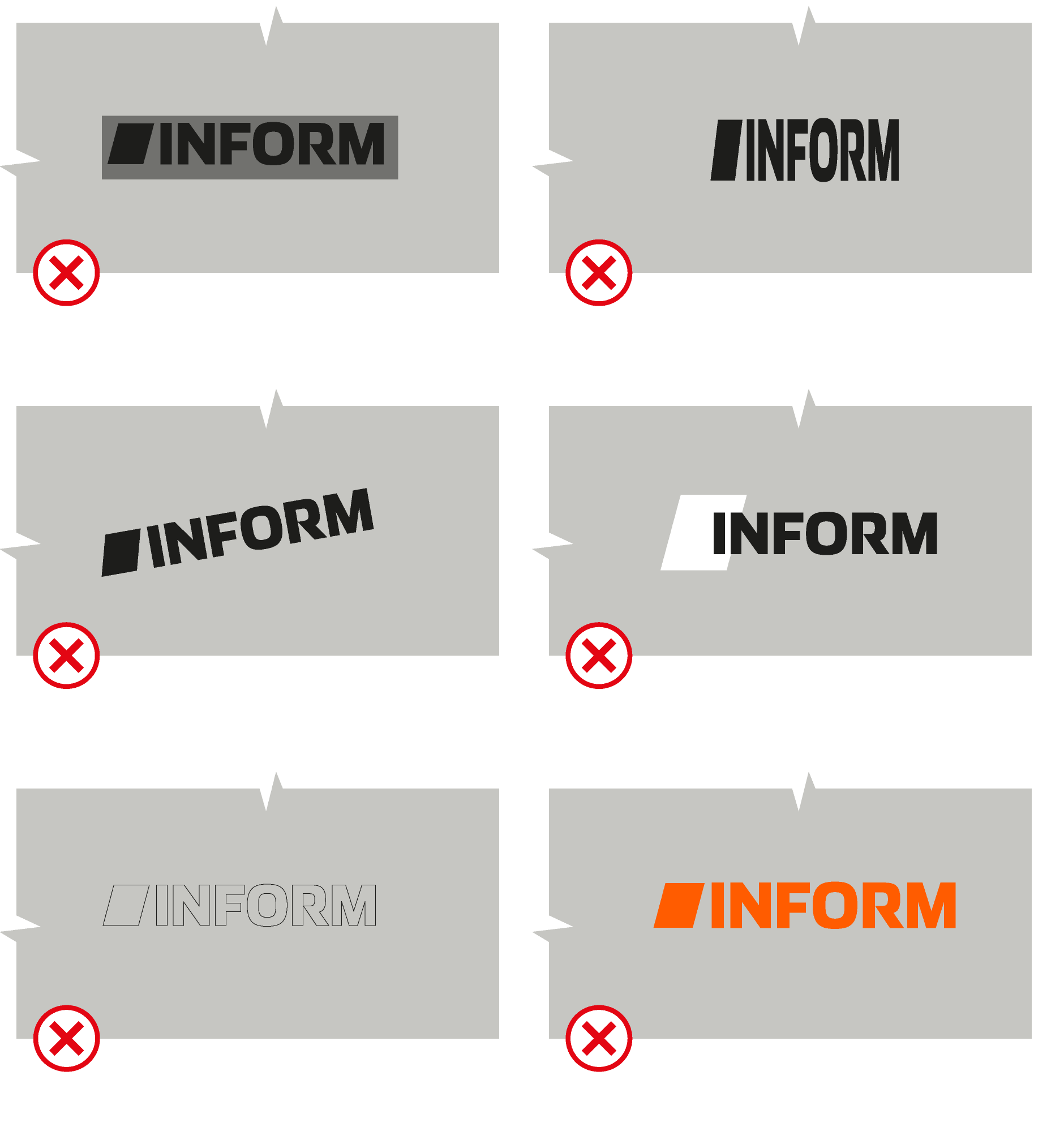
Strict design rules apply to the INFORM logo. To protect the recognizability and integrity of our brand, the following applications are strictly prohibited:
Do not apply effects
No shadows, gradients, glows, outlines, 3D effects, transparencies, or any other graphic manipulations.
Do not make individual modifications
The logo must not be distorted, rotated, cropped, compressed, stretched, or reassembled in any way.
Do not alter the brand mark or logotype
Individual logo elements must not be isolated, replaced, redrawn, or recombined. Proportions, spacing, and alignment are fixed and must not be changed.
No free color choices
The logo may only be used in the defined color variants: black, white, or as
a logo within the BrandFrame.
No use on unsuitable backgrounds
No placement on patterns, low-contrast areas, extremely busy surfaces, or transitions that compromise legibility.
No integration into other shapes or graphics
The logo must not be framed, overlaid, illustrated, or embedded into other design elements.
No combinations with third-party logos without defined rules
Co-branding requires clearly defined sender rules — no improvised mixed solutions.
Why is this important?
Because any “decorated” treatment distorts the logo, reduces legibility, and damages brand integrity.
The logo must always appear as a single-color, clear, and unaltered signet. This is a fundamental principle of professional brand management.