The Brand Mark (Rhomboid)
The rhomboid is far more than just a graphic detail. It is INFORM’s distinctive brand mark. With its minimalist, clear shape, it embodies the essence of our brand: precision, clarity, and a forward-looking attitude. As a clearly defined CORE element, the rhomboid forms a stable constant throughout our entire design OS.
The rhomboid stands for INFORM.
It is our symbol, our visual signature – and a central design instrument that shapes, connects, and carries the entire INFORM Design OS. With extended use, it becomes an iconic shape that is effective even independently of the word mark. The rhomboid conveys our brand values in visual language, thereby acting as a visual leitmotif that makes INFORM unique.
Consistent, deliberate, and proper implementation reinforces its role as a visual anchor. The rhomboid creates recognition, structures layouts, and anchors itself permanently in the collective visual memory of our target groups. Whether as a striking icon, a navigation anchor in the digital space, or a recurring design element in campaigns, our brand mark carries our identity concisely to the outside world.

The Rhomboid – The Core of Our Visual Identity
The rhomboid does not replace our logo
The brand mark has no sender function. For official labels, sender lines, product references, or legally relevant applications, the complete INFORM logo must always be used.
Standalone use in clear, non-sender-related contexts
The standalone rhomboid is suitable for applications that support the brand but do not serve as official identification:
- Branding elements,
- Icons / UI elements,
- Navigation or information areas,
- Campaign layouts and supporting elements,
- Teasers, intro, or outro screens,
- Visual markers in digital environments.
It must not be used where a clear and explicit brand identification is required.

Even in standalone use, the defined clear space rules apply:
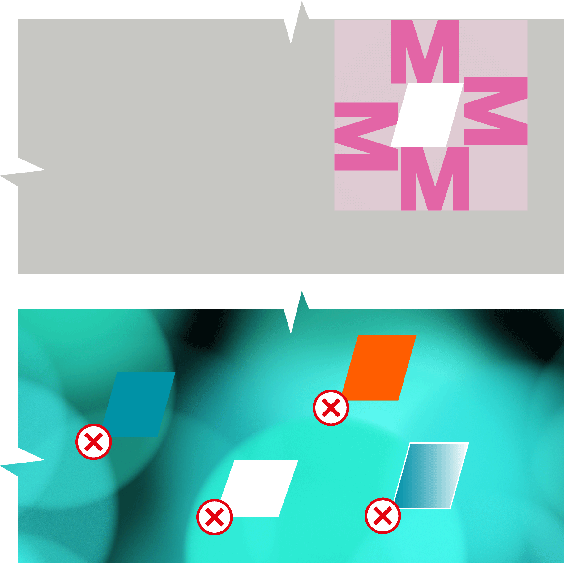
A minimum distance of one uppercase M to frames, other elements, or the format’s edge must be maintained.
No change to the shape
The rhomboid’s shape is immutable. It must not be:
- distorted,
- deformed,
- redrawn or reconstructed,
- used in custom outline, stroke, or contour variants,
- rotated or altered in perspective.
It must always appear in its original, unaltered system form.
Color usage according to the Design OS
The rhomboid is used exclusively in the defined brand colors petrol or white. No special colors, gradients, or individual color treatments are permitted.
Use depending on background contrast
The rhomboid may only be placed on backgrounds that provide sufficient contrast and ensure barrier-free legibility.
No Imagery or masking
In regular use, the rhomboid must not be used as an image mask, container, or clip shape. It appears exclusively as a single-color, solid form, stable, clear, and unchanged.
The standalone rhomboid acts as a design element, not as a statement
It serves as a structuring, brand element, not as a message carrier.
It creates orientation, recognition, and brand presence, but does not take
on the function of a logo, headline, or visual statement.