
TYPOGRAPHY
Font plays a fundamental role in branding and communication. Corporate fonts must be used consistently to ensure that INFORM GmbH branding is strengthened over time. A corporate font is a font that is used mainly or even exclusively by one company.
For all public media, from print material (customer magazines, brochures, flyers, etc.) to the website, INFORM now uses Bunday™Sans Pro as its corporate font. This font will be provided to colleagues with experience in graphic design. Furthermore, we ask that you contact Corporate Marketing for design and layout consultation when creating marketing material.
We will continue to use Arial as our font for all standard MS Office applications.
Our corporate font
The font defined as our corporate font is a version of Bunday™Sans Pro from Buntype. It was specifically modified for INFORM and is used in all external communications.
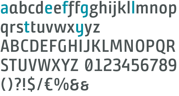
Bunday™Sans Pro SG contains more than 1,000 different characters and supports 34 languages.
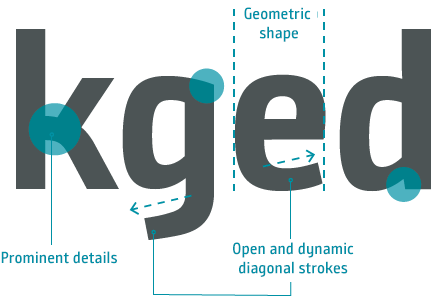
Some of the alternative letter shapes help ensure that our new, distinguishing corporate font differentiates us from other more ordinary fonts in our market.
Characters and characteristics of Bunday™Sans Pro SG:
Our corporate font is called Bunday™Sans Pro SG.
It uses geometrically modern strokes and is novel, fresh, and succinct, and fulfills all of the requirements of INFORM GmbH external communications.
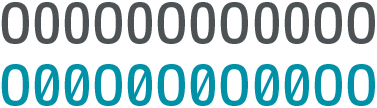
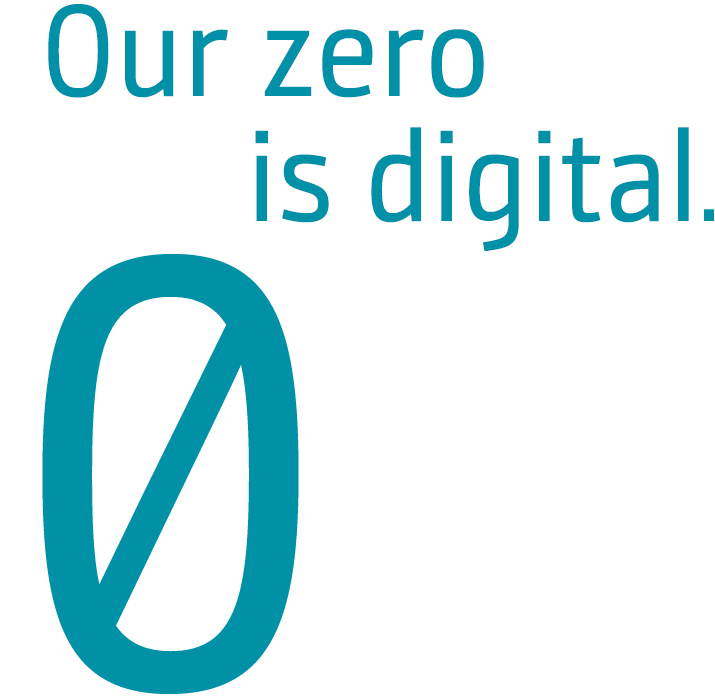
As part of our typography, the slashed zero is a distinct element that supports brand recognition.
Another advantage is that it is impossible to mistake it for the letter O. This happens often in texts that use both letters and numbers (a prime example is your personal identity card).
Although Bunday™Sans Pro SG has a space-saving design and is narrow, it is easy to read thanks to its homogeneous text image.
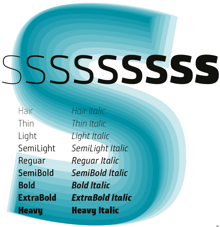
The well-developed font family has nine typefaces (plus matching italic typefaces) and has grown to meet all typographical requirements, providing plenty of room for creativity, even in the challenging editorial field.
The font is manually hinted¹ and contains extensive, manually created kerning tables² to ensure perfect branding across all media, both online and offline.
Licensing notes:
INFORM has purchased 20 licenses for use by company graphic designers. These licenses may not be transferred to external persons or companies. Misuse of a license violates copyright law and can result in criminal prosecution.
²Kerning = the adjustment of individual and sometimes difficult letter combinations.
Typefaces and expansion of Bunday™Sans Pro SG:
Common font sizes for Bunday™ Sans Pro SG
Running text
Line spacing: 13pt / 5 mm
Character spacing: -10
Font weights: Semilight / Semibold / Bold
For logo text we prefer “SemiLight,” font size 10.168 pt. (vh 2.5 mm). Use Bold to emphasize words within a text.
Character spacing is minimal and set to (-10) by default.
Subheaders in copy that is lengthy should appear in Bold.
Leadcopy M
Line spacing: 20pt / 7,5 mm
Character spacing: -10
Font weights: Light / Semibold
For short, introductory texts and lead-ins we use Light, font size 16.272 pt. (vh 4 mm). Use Semibold to emphasize text.
Leadcopy L oder Headline M
Line spacing: 26pt / 9,5 mm
Character spacing: -10
Font weights: Light / Semibold
For short, introductory texts we use Light, font size 20.335 pt. (vh 5 mm). Use Semibold to emphasize text.
Caption
Line spacing: 8pt / 3 mm
Character spacing: -10
Font weights: Semilight / Semibold
For captions and marginal texts that appear in narrow, small columns use SemiLight, font size 6.101 pt. (vh 1.5 mm). Use Bold to emphasize words within a text. Character spacing is minimal and set to (-10) by default.
Headline L
Line spacing: 36pt / 13 mm
Character spacing: -10
Font weights: Bold / ExtraBold / Heavy
Headlines should appear in Bold or Extra Bold, font size 30.504 pt.
IN CERTAIN CASES, ALL CAPS WITH FONT WEIGHT HEAVY MAY BE USED.
Typefaces and other uses of Bunday™ Sans Pro SG
20 mm, 15 %
(Kurt Schwitters)
Fallback system font Arial
Arial is used only in certain cases when Bunday™ Sans Pro SG, as the corporate font, is not available.
It should be used as the font for correspondence in customary MS Office programs and also in PowerPoint presentations.
Arial may never be used in external communications (brochures, business cards, website, trade shows, etc.).
Arial contains all typefaces relevant to daily work that involves typical programs such as Microsoft Word, Excel or PowerPoint.
We use the fallback system font Arial wherever our corporate font, Bunday™Sans Pro SG, cannot be used. It is preinstalled on today’s operating systems and we therefore use it exclusively as an indispensable technical emergency backup solution.