
Introduction
These instructions provide valuable information on the use and application of the product and service marks of INFORM GmbH.
Compliance with the specifications contained in this style guide ensures the correct handling of the individual brands within the brand architecture as part of the corporate design and thus supports a holistic overall image and consistent communication.
BRAND ARCHITECTURE
Design and structure
Basically, there are different ways of using product brands, depending on the communication requirements.
Brand architecture is the interaction of all brands of a company and organizes the relationships between the brands.
Brand architecture ensures that the brands in a portfolio support each other and that their differences can be clearly identified. It regulates the roles of the individual brands, defines their positions, boundaries and
Interfaces.
The system and structure of the individual brands was deliberately designed – in the interests of continuity and applicability – on the basis of the umbrella brand.
All subordinate services and products strictly follow the principles of simplicity and recognition.
With the system shown, all structural challenges regarding consistent brand management can be solved throughout the company.
HOW THE PRODUCT BRANDS CAN BE USED
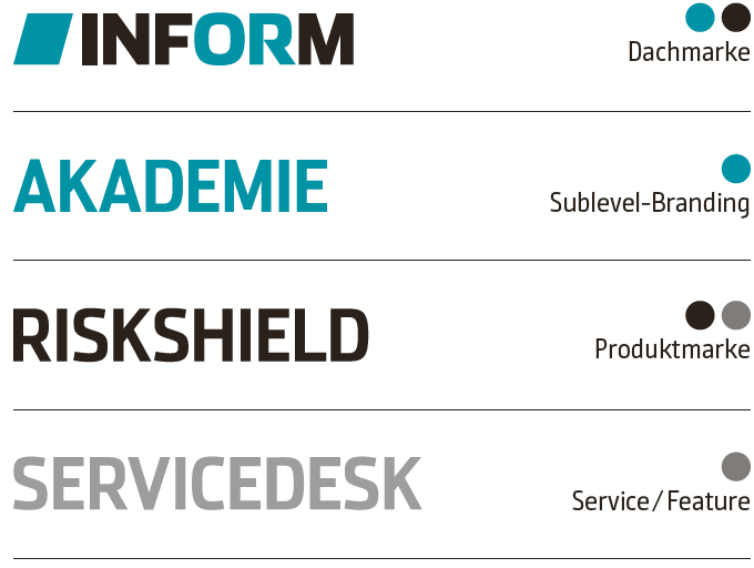
Brand Equality / Individual
In the horizontal/vertical placement of product and service brands, product brands are placed equally to the left/right of or below/above the INFORM logo.
The minimum distances shown on the right apply.
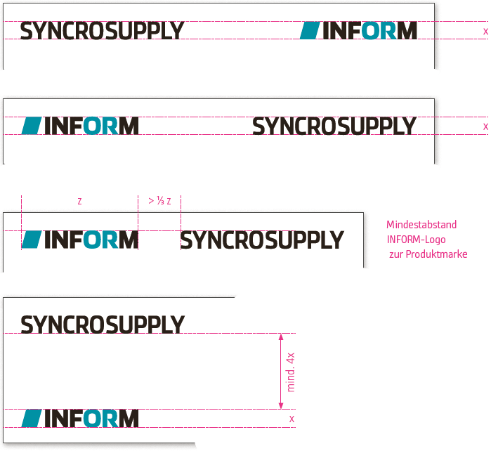
Branded House – Monolithic
This form consistently supports the umbrella brand and primarily assigns products and services to the company.
Mainly to be used where there is no option of a horizontal
Product brands and logo combination exists.
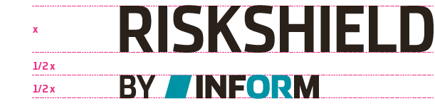
MINIMUM DISTANCES
The defined minimum amount of space around the word mark on all sides, meaning the amount of clear space, should equal at least the height of the uppercase letters (I, N, F or M) when completely straight.
The upper corner of the rhombus (the image element) is the reference point for spacing around it. These guidelines provide for an optically harmonious look and ensure that no other graphical elements compete with the logo.
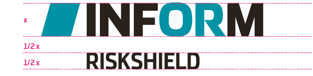
Endorsed Brand
This structure puts the product very much in the foreground, the company is carried along as an anchor and common denominator.
Only used where there is no option for a horizontal logo combination.
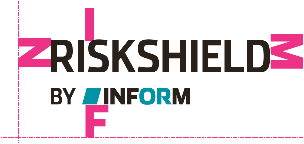
MINIMUM DISTANCES
The defined minimum distance from the brand on all sides – the sovereign zone – should at least correspond to the height of the straight capital letters (I,N,F, E or M) of the product brand.
These guidelines provide for an optically harmonious look and ensure that no other graphical elements compete with the logo.
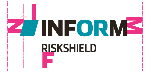
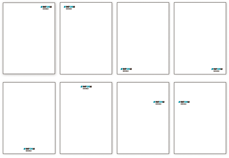
PLACEMENT OF PRODUCT BRANDS
minimum distances
There are basically many different, useful placement options for the individual product brands on the respective formats.
However, always take into account the protected sovereign zones, i.e. the required minimum distance or white space around the individual product brands.
You should also pay attention to a cross-media, congruent placement of the logotypes. The positioning within a medium (e.g. brochure/s) should always be consistent.

preferred placement on brochure covers
Downloads
The ZIP files contain all versions of the respective logo.